Navigation
Install the app
How to install the app on iOS
Follow along with the video below to see how to install our site as a web app on your home screen.
Note: This feature may not be available in some browsers.
More options
You are using an out of date browser. It may not display this or other websites correctly.
You should upgrade or use an alternative browser.
You should upgrade or use an alternative browser.
OOOOps!!! Antarctic sea ice shows "significant expanding!!!
- Thread starter skookerasbil
- Start date
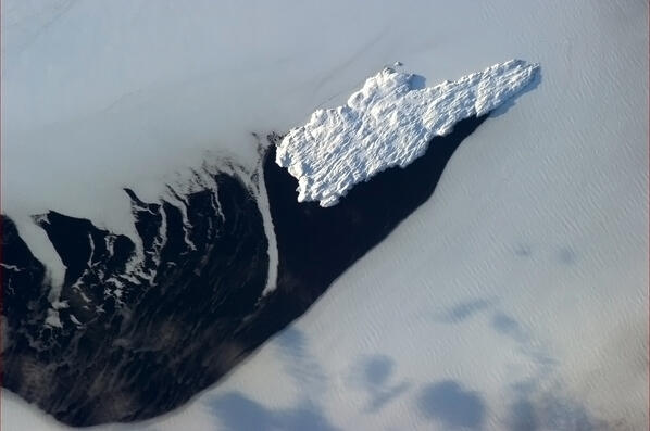
The Belle Isle Strait is the shortcut to Europe.
Newfoundland`s natural ice breaker at work:
https://twitter.com/Cmdr_Hadfield/status/319784236859146240
"Melting" has nothing to do with it
https://twitter.com/Cmdr_Hadfield/
Newfoundland`s natural ice breaker at work:
https://twitter.com/Cmdr_Hadfield/status/319784236859146240
"Melting" has nothing to do with it
https://twitter.com/Cmdr_Hadfield/
SSDD
Gold Member
- Nov 6, 2012
- 16,672
- 1,966
- 280
If what you just stated were true (mr. sock) the laws would allready be in place and the temps would still be rising instead of remaining flat for the last 16 years. But that would be science and you religious fanatics don't do science.
But they haven't remained flat:

You can cherry pick the data all you want, but it doesn't change the facts.
Says the guy who is cherrypicking data just from 1975 in an attempt to show a more pronounced warming trend.
If what you just stated were true (mr. sock) the laws would allready be in place and the temps would still be rising instead of remaining flat for the last 16 years. But that would be science and you religious fanatics don't do science.
But they haven't remained flat:
You can cherry pick the data all you want, but it doesn't change the facts.
Says the guy who is cherrypicking data just from 1975 in an attempt to show a more pronounced warming trend.
There is also an alarming increase of traffic fatalities on U.S. highways correlating with an R^2 of 0.97 to the number of metric tonnes of lemons trucked in from Mexico

Last edited:
Pop23
Gold Member
More water cool.
Hey, if it gets me to the beach a couple hours quicker and I burn less fossil fuel to get there, sounds like a win/win to me.
SSDD
Gold Member
- Nov 6, 2012
- 16,672
- 1,966
- 280
There is also an alarming increase of traffic fatalities on U.S. highways correlating with an R^2 of 0.97 to the number of metric tonnes of lemons trucked in from Mexico
Italian lemons would seem to be much safer for everyone in addition to being more tasty.
If what you just stated were true (mr. sock) the laws would allready be in place and the temps would still be rising instead of remaining flat for the last 16 years. But that would be science and you religious fanatics don't do science.
But they haven't remained flat:
You can cherry pick the data all you want, but it doesn't change the facts.
And don't get all "carbon-tax" on me. I'm of the opinion it doesn't matter what we do, the die is cast.
But I'd much rather face the next 30 years fully aware of what's going on than be a clueless, brainwashed dolt.
Of course, YMMV.
Speaking of cherry picking. How about showing the graph prior to that which you show.
Go ahead...I dare you.
SSDD
Gold Member
- Nov 6, 2012
- 16,672
- 1,966
- 280
\Speaking of cherry picking. How about showing the graph prior to that which you show.
Go ahead...I dare you.
Can't do that...it reduces the fear factor to about zero.
joewp
Member
- Jan 25, 2013
- 178
- 13
- 16
If what you just stated were true (mr. sock) the laws would allready be in place and the temps would still be rising instead of remaining flat for the last 16 years. But that would be science and you religious fanatics don't do science.
But they haven't remained flat:
You can cherry pick the data all you want, but it doesn't change the facts.
Says the guy who is cherrypicking data just from 1975 in an attempt to show a more pronounced warming trend.
Oh yeah, that full instrument record shows over-all cooling, so I'm distorting the data...
So here's the full data back to 1880...

Yeah, it does look like 1975 on is cherry picking. The slope of that data is greater than the slope of the warming from 1920 to 1940 (when it stopped for a while due to all the particulate matter from WWII and the industrial revolution's "second wind".
So yeah, you're right. When starting from 1975, you have no idea that the warming in the past was much slower. So it would mislead you into thinking the warming is steady state instead of getting faster as it really is.
Thanks for making me clear that up.
joewp
Member
- Jan 25, 2013
- 178
- 13
- 16
If what you just stated were true (mr. sock) the laws would allready be in place and the temps would still be rising instead of remaining flat for the last 16 years. But that would be science and you religious fanatics don't do science.
But they haven't remained flat:
You can cherry pick the data all you want, but it doesn't change the facts.
And don't get all "carbon-tax" on me. I'm of the opinion it doesn't matter what we do, the die is cast.
But I'd much rather face the next 30 years fully aware of what's going on than be a clueless, brainwashed dolt.
Of course, YMMV.
Speaking of cherry picking. How about showing the graph prior to that which you show.
Go ahead...I dare you.
I did already, I didn't need your "dare". And thanks for helping me make the point that the warming since 1975 is actually faster than the warming 1920-1940!
Nice job.
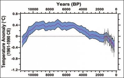
Actually I was thinking of this one. 100 years is the blink of an eye in the cycles of the planet. Those run for hundreds and thousands of years as this graph shows. When placed in the greater context your graph is cute....meaningless, but cute...
Attachments
SSDD
Gold Member
- Nov 6, 2012
- 16,672
- 1,966
- 280
Oh yeah, that full instrument record shows over-all cooling, so I'm distorting the data...
So here's the full data back to 1880...
Guess you aren't aware of what nasa, et al have been doing with the temperature record back to 1880. Since 2008 they have systematically cooled 754 months and 739 of those months were prior to 1960...then they systematically warmed 793 months with 570 of those months being post 1959.
Your chart is meaningless because it reflects nothing but data that has been systematically tampered with.
joewp
Member
- Jan 25, 2013
- 178
- 13
- 16
Nope, not aware of that. I'd like to read more. Got a link?Oh yeah, that full instrument record shows over-all cooling, so I'm distorting the data...
So here's the full data back to 1880...
Guess you aren't aware of what nasa, et al have been doing with the temperature record back to 1880. Since 2008 they have systematically cooled 754 months and 739 of those months were prior to 1960...then they systematically warmed 793 months with 570 of those months being post 1959.
Your chart is meaningless because it reflects nothing but data that has been systematically tampered with.
Old Rocks
Diamond Member
Speaking of cherry picking. How about showing the graph prior to that which you show.
Go ahead...I dare you.
I did already, I didn't need your "dare". And thanks for helping me make the point that the warming since 1975 is actually faster than the warming 1920-1940!
Nice job.
Actually I was thinking of this one. 100 years is the blink of an eye in the cycles of the planet. Those run for hundreds and thousands of years as this graph shows. When placed in the greater context your graph is cute....meaningless, but cute...
Now this dumb fuck calls himself a geologist. Then he compares a chart of ten thousand years of an Interglacial with a temperature variation of 1 degree C with a period, the last 150 years, that has a temperature increase of 0.7 C. That means that we will have raised the temperature, in a mere 200 years, to the point equal to the variation over the whole of that ten thousand years on his chart.
Cute? Old man, that kind of logic indicates senile mind.
Old Rocks
Diamond Member
Nope, not aware of that. I'd like to read more. Got a link?Oh yeah, that full instrument record shows over-all cooling, so I'm distorting the data...
So here's the full data back to 1880...
Guess you aren't aware of what nasa, et al have been doing with the temperature record back to 1880. Since 2008 they have systematically cooled 754 months and 739 of those months were prior to 1960...then they systematically warmed 793 months with 570 of those months being post 1959.
Your chart is meaningless because it reflects nothing but data that has been systematically tampered with.
SSDD will not have a link, because he routinely post garbage like this, that he pulls out of his ass.
Old Rocks
Diamond Member
joewp
Member
- Jan 25, 2013
- 178
- 13
- 16
Nope, not aware of that. I'd like to read more. Got a link?Guess you aren't aware of what nasa, et al have been doing with the temperature record back to 1880. Since 2008 they have systematically cooled 754 months and 739 of those months were prior to 1960...then they systematically warmed 793 months with 570 of those months being post 1959.
Your chart is meaningless because it reflects nothing but data that has been systematically tampered with.
SSDD will not have a link, because he routinely post garbage like this, that he pulls out of his ass.
Lots of people like that around here, I see!

SSDD
Gold Member
- Nov 6, 2012
- 16,672
- 1,966
- 280
SSDD will not have a link, because he routinely post garbage like this, that he pulls out of his ass.
I will never understand why you guys lie so much. Links have been provided in the past but I will provide them again. Doesn't it bother you to be commonly known as a liar?
SSDD
Gold Member
- Nov 6, 2012
- 16,672
- 1,966
- 280
Nope, not aware of that. I'd like to read more. Got a link?
Sure, here is a place to start. Lots of examples with links to the original stories, papers, and or data bases.
C3: Fabricating Fake Temperatures
Similar threads
- Replies
- 30
- Views
- 822
- Replies
- 118
- Views
- 3K
- Replies
- 27
- Views
- 739
- Replies
- 142
- Views
- 3K
Latest Discussions
- Replies
- 11
- Views
- 54
- Replies
- 2
- Views
- 12
- Replies
- 2K
- Views
- 34K
- Replies
- 2
- Views
- 13
Forum List
-
-
-
-
-
Political Satire 8399
-
-
-
-
-
-
-
-
-
-
-
-
-
-
-
-
-
-
-
ObamaCare 781
-
-
-
-
-
-
-
-
-
-
-
Member Usernotes 477
-
-
-
-
-
-
-
-
-
-