Toddsterpatriot
Diamond Member
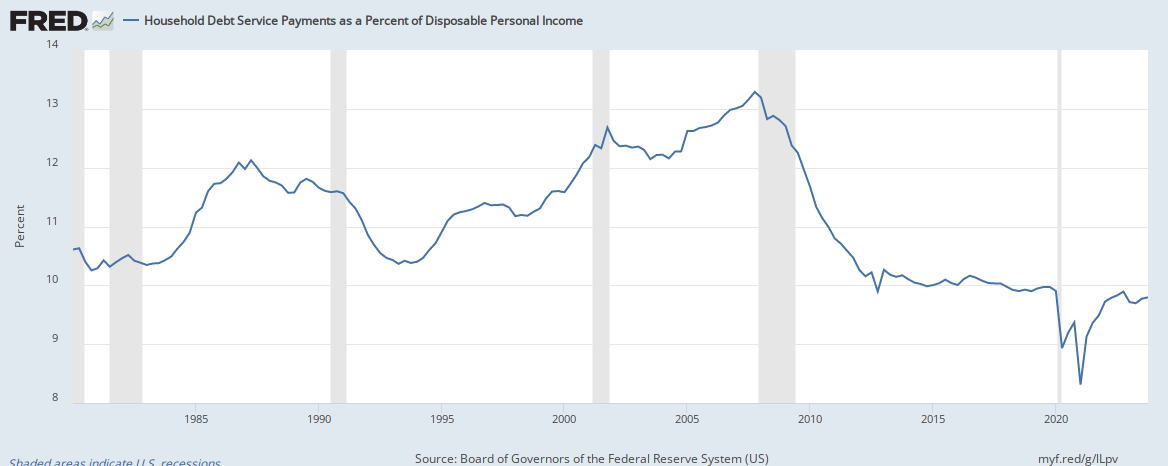
It starts at the beginning of 1980.Do you check anything before you post it?Unfortunately, people are spending far more than they are making.
U.S. Household Debt Exceeds $14 Trillion for the First Time
1 out of 3 people run out of money before payday. Even those making 100 grand a year!!
This can't continue. This bubble is going to burst eventually.
Nearly 1 in 3 American workers run out of money before payday—even those earning over $100,000
Household debt service as a percentage of disposable income is the LOWEST ever recorded!
Huge: More ‘better off’ under Trump than Clinton, Bush, and Obama.
Another day, another positive Gallup headline for President Trump.
Today’s delivered more economic good news for Trump, that people feel “better off” than they did when the past four presidents were up for reelection.
A record 61% said they are better off than they were three years ago when Trump beat Democrat Crooked Hillary.
“Six in 10 U.S. adults say they are better off than they were three years ago, more than reported this in prior presidential reelection years,” said Gallup.
No wonder so many people hate him. The man is a monster!
Hardly. Your chart starts in 1985.
That's what you use to service debt.... And it's the percentage of "disposable income"...
You forget this part:The limitations of current sources of data make the calculation of the ratio especially difficult. The ideal data set for such a calculation would have the required payments on every loan held by every household in the United States. Such a data set is not available, and thus the calculated series is only an approximation of the debt service ratio faced by households.
Nonetheless, this approximation is useful to the extent that, by using the same method and data series over time, it generates a time series that captures the important changes in the household debt service burden.
Contrary to the false claims in the opening paragraph, households have more available resources to meet current debt payments, than at anytime in the last FORTY YEARS!
This chart also starts at 1980, and uses income rather than disposable income, and again, finds US households in the best shape in nearly 40 years.

Actually, the chart shows that debt service ratios were this low under Obama as well, but you chose to ignore than to pimp the Liar in Chief.
The FRED's disclaimers basically say, that if you use faulty data consistently, it will yield correct results. I'm not buying it.
How people "feel" about their financial situations is a poor measure of the economy, especially when those feelings aren't borne out by the actual data.
For 8 years Republicans called Obama a failure and you bought into those feelings in electing Trump. Now you're convinced that things are better under Trump, but the data simply doesn't support your "feelings".
You're being conned. Again.
The FRED's disclaimers basically say, that if you use faulty data consistently, it will yield correct results.
Liar.
I'm not buying it.
Well, you're an idiot, so you've got that going for you.


