- Thread starter
- #81
I already told you ian...print the graph from 1970 and the graph from 2006...the black lines are identical...not comparing observation to models...comparing observation to observation.
Okay, observation to observation. Both graphs are taken under very similar conditions. They produce very similar results. So what? Which changes were you expecting? What is the size of those changes? Would they even be visible at the scale of these graphs?
I am trying to understand your point but you haven't made it clear.
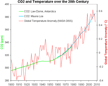
You are not talking about surface warming because you have defined the temperature as being similar (although it appears that the 2006 graph is about 1/2C warmer).
What specific information do you want me to glean from these graphs? And how is it important?
CO2 warms the surface. The amount would be around 1/2C for a change from 280-400 ppm. But CO2 wasn't 280 in 1970, nor 400 in 2006. Is 1/2C difference in brightness obvious in your graphs? Are the changes you are looking for smaller than the thickness of the line on the graph?
Specifically state what changes you think are missing from 1970-2006, keeping in mind that you are holding temperature invariant. And then point out where on the graph they would be found, keeping in mind that the range in your graph is for the atmospheric window where most of the GHG effects are not present.