CrusaderFrank
Diamond Member
- May 20, 2009
- 146,713
- 69,866
- 2,330
Meanwhile we froze our ass off in TX last night...
So let me get this right, OldCocks posts a graph which should leave one to conclude that the Northern Ice cap has lost about 1/3 of it's ice JUST THIS YEAR.
Logically then one can assume the sea level would have increased noticeably.
Of course it hasn't, and the pattern of deceit by the MMGW hoaxers continues unabated.
Now lets suppose you're the newly elected POTUS, and you're about to outline a budget for the next FY.
I wonder how terrified bed wetters are that a lot of the government funding that advanced this hoax may be cut off.
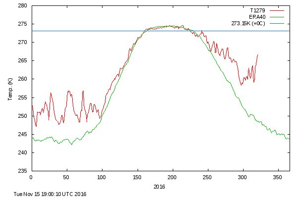
OK, so you're telling us that this wasn't a Weather event, but the climate of the Arctic is now 35F warmer. Is that still true today, can you update up on Arctic climateView image on Twitter
Follow
Zack Labe
✔@ZLabe
Today's latest #Arctic mean temperature continues to move the wrong direction... up. Quite an anomalous spike!
12:24 PM - 15 Nov 2016 · Irvine, CA
'Climate Emergency': North Pole Sees Record Temps, Melting Ice Despite Arctic Winter
"Folks, we're in a climate emergency," tweeted meteorologist Eric Holthaus.
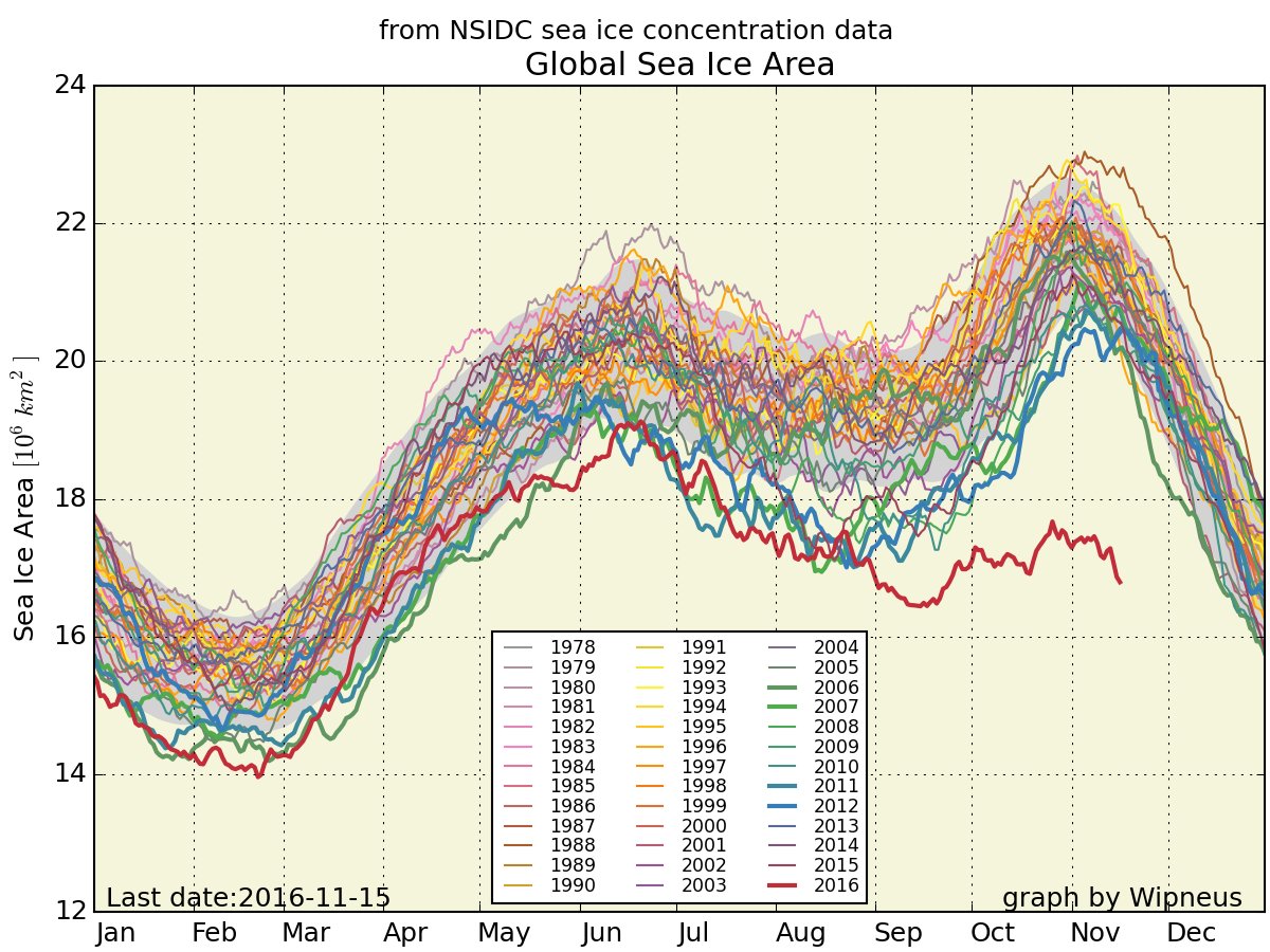
Sea ice at both poles at about three standard deviations below normal. Overall sea ice level at a major record low for this time of the year. The temperatures in the arctic way above normal. Keep a watch on this, folks, could get very interesting.


