Questions.....RE: The Greenhouse Effect

That's what we're talking about, an adjustment mainly to correct for the well-known cooling bias as imposed by the increasing number of buoys to measure sea surface temperatures.

The justification for that is vague to say the least. Karl credits Kennedy et al for 0.15deg fudge. But in the Kennedy paper it was specified as 0.15 +/- 1.7.. That's almost the equivalent of saying we're not sure WHAT it should be. .

You speak math? You'll understand the chuckle I'm having. And that's not the ONLY slight of hand that they pulled. There's 6 others "fudges" embedded in that data including the some what arbitrary "period" corrections that I posted in the Bob Tisdale chart above. It's LOADED with trivial horseshit just to be able to lie to the press and tell them "there was no pause". You're a hoot.. Hey -- I got to go put my "Good Warmer Needed" ad back up at Craig's List. BBL. :badgrin:
 
Now tell me again how well the satellite record compares to the NOAA fiction.. I love to hear that fairy tale every day..

The denier cultists are famous for their anti-science crackpot conspiracy theory insanity.

This one revolves around dementedly imagining that all of the scientists at NOAA and NASA are criminals who just fake all their data.

For sane people, the only real response to this pathological denial of reality is laughter.

In other news.. Can you name me ONE NUMBER that regularly comes out of Wash DC without a lot of cooking, baking and sketchy "definitions" ?? I can't think of ONE lately. Unemployment numbers, Obama enrollments, the "balance" in that SS Trust Fund? Why shouldn't a simple temperature record be cooked in the same kitchen?
 
From K15:

upload_2017-3-9_13-15-57-png.116084


Here's the UAH temperature anomaly (lower troposphere data).


UAH2.png


Keep in mind that the satellite record below starts at about 1978 and represents a time span considerably shorter than the one above. I've instructed the graphics generator to calculate and add a trendline for the willfully visually impaired.

So, there are some differences, but quite a few similarities. Apparently, smoothing plays a role, and I wasn't able to figure out whether the data for the UAH record had any corrections for, say, satellite drift and orbital decay.
 
Last edited:
Do you actually believe that to be an argument with merit?

Yes. There's an agenda behind making a well timed press release to "bust the pause". And nothing really get busted besides reputations and credibility. And redefining "indexes" is one thing the govt excels at. Nobody would ever get punished in assisting the current admin to achieve an agenda or in "looking good". Whether they wear a badge or a judicial robe or a labcoat Are you kidding? :rock:

PM me -- tell me how much "value" is in the Soc Sec Trust Fund for example. It'll be fun. You'll see how it's done.
You're naive if just watch the oft-quoted "unemployment rate" that the MEDIA uses.

What makes you believe the #1 policy issue (AGW) is worth in terms of being a good Doobie and busting "the Pause"???

I don't give a shit about "the Pause". None of my convictions hinge on it. IN FACT --- it illustrates the complexity of the system and our inabilities in modeling and prediction. Actually works in my favor whether the rate is 0.01deg/decade or 0.03deg/decade. Whoopyshit.....
 
The denier cultists are famous for their anti-science crackpot conspiracy theory insanity.

This one revolves around dementedly imagining that all of the scientists at NOAA and NASA are criminals who just fake all their data.

For sane people, the only real response to this pathological denial of reality is laughter.


The telltale sign, as you rightly noted (and the one they share with run-of-the-mill trolls), is that they make up for the inability to win a single argument by impugning the integrity or intelligence of their opponents, often with a dollop of paranoia and - Believe me! - criminality everywhere. The other side of that coin is, every crank and tabloid publication, from powerlineblog to the Daily Caller, deserves infinite trust.
 
From K15:

upload_2017-3-9_13-15-57-png.116084


Here's the UAH temperature anomaly (lower troposphere data).


View attachment 116160

Keep in mind that the satellite record below starts at about 1978 and represents a time span considerably shorter than the one above. I've instructed the graphics generator to calculate and add a trendline for the willfully visually impaired.

So, there are some differences, but quite a few similarities. Apparently, smoothing plays a role, and I wasn't able to figure out whether the data for the UAH record had any corrections for, say, satellite drift and orbital decay.

Yeah perfectly fine. Now get that data and find the trend line from 1998 to 2014.. That's the pause. Use 1999 if you want. It's will be almost zero on satellite. USED TO BE almost zero a couple years in the IPCC report and most ALL land-based records. Funny deal is -- You can't even SEE it in the Karl data because it looks like the study data ends in 2010.5. And because they REMOVED the El Nino and other landmarks. With all that filtering (or the time sparse data that was used) it's crap. I'll stick with the sat records thank you..

Apparently, smoothing plays a role, and I wasn't able to figure out whether the data for the UAH record had any corrections for, say, satellite drift and orbital decay.

The database at UAH is monthly. So somehow it got 'smoothed' in your graph. And it's all perfectly corrected for all of that. Did you get the slope of that trendline? Now run a trendline thru "the Pause". Tell me what you get.
 
Now tell me again how well the satellite record compares to the NOAA fiction.. I love to hear that fairy tale every day..

The denier cultists are famous for their anti-science crackpot conspiracy theory insanity. This one revolves around dementedly imagining that all of the scientists at NOAA and NASA are criminals who just fake all their data.

For sane people, the only real response to this pathological denial of reality is laughter.

In other news.. Can you name me ONE NUMBER that regularly comes out of Wash DC without a lot of cooking, baking and sketchy "definitions" ?? I can't think of ONE lately. Unemployment numbers, Obama enrollments, the "balance" in that SS Trust Fund? Why shouldn't a simple temperature record be cooked in the same kitchen?

Do you actually believe that to be an argument with merit?

Yes. There's an agenda behind making a well timed press release to "bust the pause". And nothing really get busted besides reputations and credibility. And redefining "indexes" is one thing the govt excels at. Nobody would ever get punished in assisting the current admin to achieve an agenda or in "looking good". Whether they wear a badge or a judicial robe or a labcoat Are you kidding?

PM me -- tell me how much "value" is in the Soc Sec Trust Fund for example. It'll be fun. You'll see how it's done.
You're naive if just watch the oft-quoted "unemployment rate" that the MEDIA uses.

What makes you believe the #1 policy issue (AGW) is worth in terms of being a good Doobie and busting "the Pause"???

LOLOLOLOLOLOLOLOL.....

One team of climate scientists reanalyzed ocean temperature records and discovered flaws in the data set that had led to errors in the temperature record. When these errors were corrected, they found that there was very little change in the rate of global warming over the 21st century as compared to the rate over the last few decades of the twentieth century.....or, in other words, the supposed 'pause' in the rate of the upward trend in global warming was not really there. Other teams of scientists have independently come out with similar findings.

Since the non-existent pause was a major part of denier cult mythology denying human caused global warming, they are now reverting to their usual demented tactic for explaining away all of the actual scientific evidence that debunks their cultic dogmas.....just as I mentioned a bit earlier in this thread.....

"The denier cultists are famous for their anti-science crackpot conspiracy theory insanity. This one revolves around dementedly imagining that all of the scientists at NOAA and NASA are criminals who just fake all their data. For sane people, the only real response to this pathological denial of reality is laughter."
 
Here's a clue to the value of your trendline.

clip_image006_thumb1.png


Note please. That 1.37degC/century???? Right on track to be the UNSCARY, UN-disastrous value of BASIC CO2 warming without the hype of accelerations, net positive feedbacks, or doomsday "triggers".... With about 40% being natural variation.
 
Now tell me again how well the satellite record compares to the NOAA fiction.. I love to hear that fairy tale every day..

The denier cultists are famous for their anti-science crackpot conspiracy theory insanity. This one revolves around dementedly imagining that all of the scientists at NOAA and NASA are criminals who just fake all their data.

For sane people, the only real response to this pathological denial of reality is laughter.

In other news.. Can you name me ONE NUMBER that regularly comes out of Wash DC without a lot of cooking, baking and sketchy "definitions" ?? I can't think of ONE lately. Unemployment numbers, Obama enrollments, the "balance" in that SS Trust Fund? Why shouldn't a simple temperature record be cooked in the same kitchen?

Do you actually believe that to be an argument with merit?

Yes. There's an agenda behind making a well timed press release to "bust the pause". And nothing really get busted besides reputations and credibility. And redefining "indexes" is one thing the govt excels at. Nobody would ever get punished in assisting the current admin to achieve an agenda or in "looking good". Whether they wear a badge or a judicial robe or a labcoat Are you kidding?

PM me -- tell me how much "value" is in the Soc Sec Trust Fund for example. It'll be fun. You'll see how it's done.
You're naive if just watch the oft-quoted "unemployment rate" that the MEDIA uses.

What makes you believe the #1 policy issue (AGW) is worth in terms of being a good Doobie and busting "the Pause"???

LOLOLOLOLOLOLOLOL.....

One team of climate scientists reanalyzed ocean temperature records and discovered flaws in the data set that had led to errors in the temperature record. When these errors were corrected, they found that there was very little change in the rate of global warming over the 21st century as compared to the rate over the last few decades of the twentieth century.....or, in other words, the supposed 'pause' in the rate of the upward trend in global warming was not really there. Other teams of scientists have independently come out with similar findings.

Since the non-existent pause was a major part of denier cult mythology denying human caused global warming, they are now reverting to their usual demented tactic for explaining away all of the actual scientific evidence that debunks their cultic dogmas.....just as I mentioned a bit earlier in this thread.....

"The denier cultists are famous for their anti-science crackpot conspiracy theory insanity. This one revolves around dementedly imagining that all of the scientists at NOAA and NASA are criminals who just fake all their data. For sane people, the only real response to this pathological denial of reality is laughter."

You like silly when you put YOUR words in my mouth. I've made it clear, it's a couple dozen at most. For one thing, papers may have 3 or 10 names on them. They don't ALL GET TO CHOOSE what's said in the abstracts or the press releases. In FACT -- for the Govt -- the Press releases usually come from NON scientists in the front office. Learn how stuff works TinkerBelle.

All this bores me. And is probably doesn't have much to do with the GH effect.
 
The LA Times graphic is identical to Karl et al's save it has the endpoint labeled. It was in response to your statement that Karl's looked as if it ended at 2010.5.
 
Here's a clue to the value of your......
....bogus, made-up denier cult bullcrap graph from a discredited propaganda outlet for fossil fuel industry lies.

XXXX -- Mod Edit -- Editing within the quote boxes is a no no...


In the real world.....

no-slow-down-in-global-warming-web.jpg


Global mean surface temperature change from 1880 to 2016, relative to the 1951–1980 mean. The black line is the global annual mean and the red line is the five-year lowess smooth. The blue uncertainty bars show a 95% confidence limit. Source: NASA GISS.

 
Last edited by a moderator:
Tell me olde euro -- You see a 0.2DegC or MORE anomaly in 1998?? I don't.

Yeah, you don't even understand that UAH is measuring "lower atmosphere". Is that the same as that which buoys are measuring? But you think UAH and NOAA data should look exactly alike. Or rather, you get to pick and choose the one you like more, because... somehow the Daily Caller and WUWT omitted to inform you about that.

Just enjoy your bliss. Nothing to see here. Don't even ASK yourself what type of final filtering was applied to that data to remove it. Be oblivious !!! Be Happy !!! Enjoy the warm weather. :up:

But you sure know how to play with yourself.

A mere 5 or 8 years ago, they agreed BRILLIANTLY. I've got the web archives to prove it. You would think AIR above the surface would have LESS El Nino heat since the source is the WATER !!! So why doesn't it NOW. It used to be a prominant feature. Why is every fucking NOAA graph I look at DIFFERENT?? Don't believe me -- look at the ones Tinkerbelle just posted and compare to the Karl graphs..

They SHOULD look alike and they DID. Wasn't it you claiming a few pages that the Karl changes matched the satellites?
 
Last edited:
Hey Tink !!! RollingThunder If you don't see the difference between the OFFICIAL UAH chart.


UAH_LT_1979_thru_June_2012.png


And the "daily caller" graph -----

UAH_LT_1979_thru_December_2015_v6-1.png


And a shorter Pause version of that data from WUWT ----

clip_image006_thumb1.png


Then :anj_stfu: 
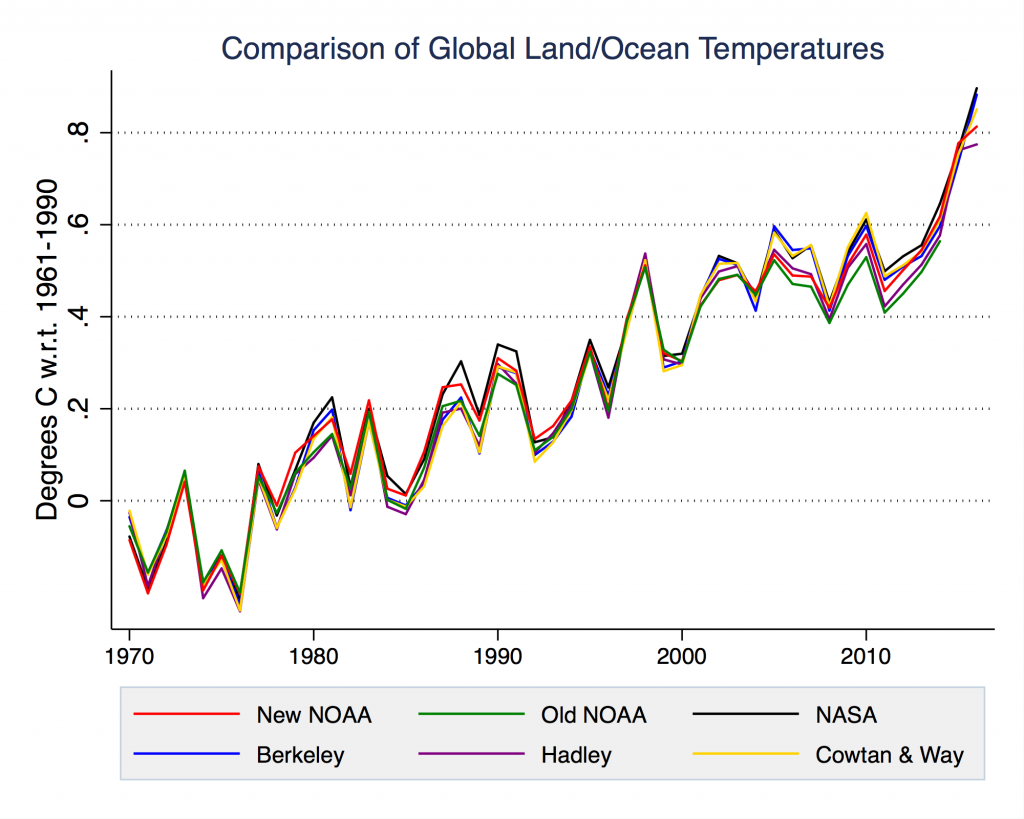
Every NOAA chart I've seen in the thread doesn't agree with the others. THERE'S a problem for ya !!!
 
You would think AIR above the surface would have LESS El Nino heat since the source is the WATER !!!

Nah, it's just you who would "think" that. For, when the Pacific, due to a regional hot spot, releases some of the stored heat content toward the atmosphere, it should be the atmosphere that is unusually hot. Moreover, you apparently don't understand the charts either. They are depicting temperature ANOMALY compared to some earlier average, not temperatures, and thus including more slowly warming / cooling oceans results in a less steep trend, and smaller amplitudes, even though the oceans are somewhat warmer than the atmosphere. But yeah, these graphs depicting lower troposphere or the ocean surface temperature anomalies looked exactly alike some years ago. Risible.
 

Forum List

Back
Top