The Hockey Stick Graph Reality

2 decades...no warming.
Nope! Those two decades had the same general warming trend as the previous two decades.


(Credit: NOAA)


Why does reality deny the truth of Global warming?
Reality confirms the truth of human caused global warming, CrazyFruitcake, it is your crackpot anti-science denier cult myths that deny reality.

UAH_LT_1979_thru_May_2015_v6.png


Real, accurate, recent measurements show a 2 decade pause
 
Dr. Mann's original Hockey-Stick Graph showing that global temperatures are rising way faster now than anytime in over a thousand years has been scientifically confirmed many, many times over by now by other teams of scientists all around the world, and it has been extended much farther back in time. It is now clear that late twentieth century and current warming is happening much faster than any previous warming over the entire Holocene period, or at least 11 thousand years.

Here's the science.

Paleoclimate: The End of the Holocene
Dr. Stefan Rahmstorf
RealClimate
16 September 2013
(excerpts)
Recently a group of researchers from Harvard and Oregon State University has published the first global temperature reconstruction for the last 11,000 years – that’s the whole Holocene (Marcott et al. 2013).

A while ago, I discussed here the new, comprehensive climate reconstruction from the PAGES 2k project for the past 2000 years. But what came before that? Does the long-term cooling trend that ruled most of the last two millennia reach even further back into the past?

Over the last decades, numerous researchers have painstakingly collected, analyzed, dated, and calibrated many data series that allow us to reconstruct climate before the age of direct measurements. Such data come e.g. from sediment drilling in the deep sea, from corals, ice cores and other sources. Shaun Marcott and colleagues for the first time assembled 73 such data sets from around the world into a global temperature reconstruction for the Holocene, published in Science. Or strictly speaking, many such reconstructions: they have tried about twenty different averaging methods and also carried out 1,000 Monte Carlo simulations with random errors added to the dating of the individual data series to demonstrate the robustness of their results.

To show the main result straight away, it looks like this:


Figure 1 Blue curve: Global temperature reconstruction from proxy data of Marcott et al, Science 2013. Shown here is the RegEM version – significant differences between the variants with different averaging methods arise only towards the end, where the number of proxy series decreases. This does not matter since the recent temperature evolution is well known from instrumental measurements, shown in red (global temperature from the instrumental HadCRU data). Graph: Klaus Bitterman.

The climate curve looks like a “hump”. At the beginning of the Holocene -- after the end of the last Ice Age -- global temperature increased, and subsequently it decreased again by 0.7 ° C over the past 5000 years. The well-known transition from the relatively warm Medieval into the “little ice age” turns out to be part of a much longer-term cooling, which ended abruptly with the rapid warming of the 20th Century. Within a hundred years, the cooling of the previous 5000 years was undone. (One result of this is, for example, that the famous iceman ‘Ötzi’, who disappeared under ice 5000 years ago, reappeared in 1991.)

Comparison with the PAGES 2k reconstruction

The data used by Marcott et al. are different from those of the PAGES 2k project (which used land data only) mainly in that they come to 80% from deep-sea sediments. Sediments reach further back in time (far further than just through the Holocene – but that’s another story). Unlike tree-ring data, which are mainly suitable for the last two thousand years and rarely reach further. However, the sediment data have poorer time resolution and do not extend right up to the present, because the surface of the sediment is disturbed when the sediment core is taken. The methods of temperature reconstruction are very different from those used with the land data. For example, in sediment data the concentration of oxygen isotopes or the ratio of magnesium to calcium in the calcite shells of microscopic plankton are used, both of which show a good correlation with the water temperature. Thus each sediment core can be individually calibrated to obtain a temperature time series for each location.

Overall, the new Marcott reconstruction is largely independent of, and nicely complementary to, the PAGES 2k reconstruction: ocean instead of land, completely different methodology. Therefore, a comparison between the two is interesting:

Figure 3 The last two thousand years from Figure 1, in comparison to the PAGES 2k reconstruction (green), which was recently described here in detail. Graph: Klaus Bitterman.

As we can see, both reconstruction methods give consistent results. That the evolution of the last one thousand years is virtually identical is, by the way, yet another confirmation of the “hockey stick” by Mann et al. 1999, which is practically identical as well (see graph in my PAGES article).

Conclusion

The curve (or better curves) of Marcott et al. will not be the last word on the global temperature history during the Holocene; like Mann et al. in 1998 it is the opening of the scientific discussion. There will certainly be alternative proposals, and here and there some corrections and improvements. However, I believe that (as was the case with Mann et al. for the last millennium) the basic shape will turn out to be robust: a relatively smooth curve with slow cooling trend lasting millennia from the Holocene optimum to the “little ice age”, mainly driven by the orbital cycles. At the end this cooling trend is abruptly reversed by the modern anthropogenic warming.

The following graph shows the Marcott reconstruction complemented by some context: the warming at the end of the last Ice Age (which 20,000 years ago reached its peak) and a medium projection for the expected warming in the 21st Century if humanity does not quickly reduce greenhouse gas emissions.


Figure 4 Global temperature variation since the last ice age 20,000 years ago, extended until 2100 for a medium emissions scenario with about 3 degrees of global warming. Graph: Jos Hagelaars.

Marcott et al. dryly state about this future prospect: "By 2100, global average temperatures will probably be 5 to 12 standard deviations above the Holocene temperature mean."

In other words: We are catapulting ourselves way out of the Holocene.

Just looking at the known drivers (climate forcings) and the actual temperature history shows it directly, without need for a climate model: without the increase in greenhouse gases caused by humans, the slow cooling trend would have continued. Thus virtually the entire warming of the 20th Century is due to man. This May, for the first time in at least a million years, the concentration of carbon dioxide in our atmosphere has exceeded the threshold of 400 ppm. If we do not stop this trend very soon, we will not recognize our Earth by the end of this century.

This piece of shit graph was destroyed way back in 2004 clown boy.

Only in your crackpot denier cult myths, walleyed.

In the real world, this excellent piece of sound science has been confirmed multiple times by many different teams of scientists using a wide variety of data analysis techniques and data sources. The world scientific community accepts it fully.

What evidence is there for the hockey stick?
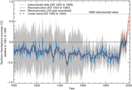
Since the hockey stick paper in 1998, there have been a number of proxy studies analysing a variety of different sources including corals, stalagmites, tree rings, boreholes and ice cores. They all confirm the original hockey stick conclusion: the 20th century is the warmest in the last 1000 years and that warming was most dramatic after 1920.

The "hockey stick" describes a reconstruction of past temperature over the past 1000 to 2000 years using tree-rings, ice cores, coral and other records that act as proxies for temperature (Mann 1999). The reconstruction found that global temperature gradually cooled over the last 1000 years with a sharp upturn in the 20th Century. The principal result from the hockey stick is that global temperatures over the last few decades are the warmest in the last 1000 years.

hockey_stick_TAR.gif

Figure 1: Northern Hemisphere temperature changes estimated from various proxy records shown in blue (Mann 1999). Instrumental data shown in red. Note the large uncertainty(grey area) as you go further back in time.

A critique of the hockey stick was published in 2004 (McIntyre 2004), claiming the hockey stick shape was the inevitable result of the statistical method used (principal components analysis). They also claimed temperatures over the 15th Century were derived from one bristlecone pine proxy record. They concluded that the hockey stick shape was not statistically significant.

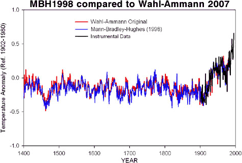
An independent assessment of Mann's hockey stick was conducted by the National Center for Atmospheric Research (Wahl 2007). They reconstructed temperatures employing a variety of statistical techniques (with and without principal components analysis). Their results found slightly different temperatures in the early 15th Century. However, they confirmed the principal results of the original hockey stick - that the warming trend and temperatures over the last few decades are unprecedented over at least the last 600 years.

MBH1999_Wahl_2007.gif

Figure 2: Original hockey stick graph (blue - MBH1998) compared to Wahl & Ammann reconstruction (red). Instrumental record in black (Wahl 2007).

While many continue to fixate on Mann's early work on proxy records, the science of paleoclimatology has moved on. Since 1999, there have been many independent reconstructions of past temperatures, using a variety of proxy data and a number of different methodologies. All find the same result - that the last few decades are the hottest in the last 500 to 2000 years (depending on how far back the reconstruction goes). What are some of the proxies that are used to determine past temperature?

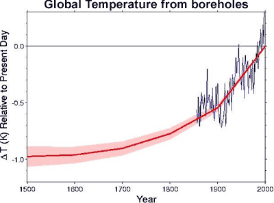
Changes in surface temperature send thermal waves underground, cooling or warming the subterranean rock. To track these changes, underground temperature measurements were examined from over 350 bore holes in North America, Europe, Southern Africa and Australia (Huang 2000). Borehole reconstructions aren't able to give short term variation, yielding only century-scale trends. What they find is that the 20th century is the warmest of the past five centuries with the strongest warming trend in 500 years.

Hockey_Stick_borehole.gif

Figure 3: Global surface temperature change over the last five centuries from boreholes (thick red line). Shading represents uncertainty. Blue line is a five year running average of HadCRUT global surface air temperature (Huang 2000).

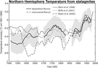
Stalagmites (or speleothems) are formed from groundwater within underground caverns. As they're annually banded, the thickness of the layers can be used as climate proxies. A reconstruction of Northern Hemisphere temperature from stalagmites shows that while the uncertainty range (grey area) is significant, the temperature in the latter 20th Century exceeds the maximum estimate over the past 500 years (Smith 2006).

Hockey_Stick_Stalagmite.gif

Figure 4: Northern Hemisphere annual temperature reconstruction from speleothem reconstructions shown with 2 standard error (shaded area) (Smith 2006).

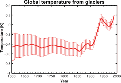
Historical records of glacier length can be used as a proxy for temperature. As the number of monitored glaciers diminishes in the past, the uncertainty grows accordingly. Nevertheless, temperatures in recent decades exceed the uncertainty range over the past 400 years (Oerlemans 2005).

Hockey_Stick_glacier.gif

Figure 5: Global mean temperature calculated form glaciers. The red vertical lines indicate uncertainty.

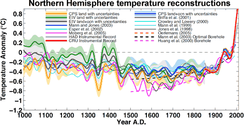
Of course, these examples only go back around 500 years - this doesn't even cover the Medieval Warm Period. When you combine all the various proxies, including ice cores, coral, lake sediments, glaciers, boreholes & stalagmites, it's possible to reconstruct Northern Hemisphere temperatures without tree-ring proxies going back 1,300 years (Mann 2008). The result is that temperatures in recent decades exceed the maximum proxyestimate (including uncertainty range) for the past 1,300 years. When you include tree-ring data, the same result holds for the past 1,700 years.

NH_Temp_Reconstruction.gif

Figure 6: Composite Northern Hemisphere land and land plus ocean temperature reconstructions and estimated 95% confidence intervals. Shown for comparison are published Northern Hemisphere reconstructions (Mann 2008).

Paleoclimatology draws upon a range of proxies and methodologies to calculate past temperatures. This allows independent confirmation of the basic hockey stick result: that the past few decades are the hottest in the past 1,300 years.


I hate to break it to ya but your anti science, denier cult religious nutbaggery, has been shown to be false waaaaay the heck back in 2004. Two. Thousand. Four! You will no doubt continue to spew your religious dogma but it is pure unadulterated horse poo as is all religious nutjob crap. This is you dude. It got old back in the 1800's, funny how you 'tards are still trapped in the old days. Windmills and sandwich boards screeching at the top of your lungs a failed religious belief system.


The-End-is-NOT-Nigh-01.jpg
This makes for interesting viewing. After posting half a dozen graphics from peer reviewed, heavily cited, scientific studies, you post a scene from a Saturday morning cartoon, reject the position of very close to 100% of the experts and call him anti-science.


Big whoop. We have seen how the peer review process wasn't just corrupted, but rendered into a fraud mill. Your point is less than compelling.
 
Amazing how they cling to that discredited hockey stick isn't it?...even after the IPCC dropped it...
 
This makes for interesting viewing. After posting half a dozen graphics from peer reviewed, heavily cited, scientific studies, you post a scene from a Saturday morning cartoon, reject the position of very close to 100% of the experts and call him anti-science.

Indeed! Watching the 'cognitive dissonance' of these bamboozled reality deniers is sometimes pretty hilarious. The wholesale rejection of science, evidence, rationality, and logic whenever they conflict with their crackpot political and economic ideologies is amazing to watch. And then there is the obvious Dunning-Kruger Effect thing they've got going that deludes them into believing that their ignorant , uninformed opinions are superior to the scientific research and conclusions from the tens of thousands of scientists around the world studying the climate and the current rapid, abrupt, CO2 driven global warming. That's particularly amusing.....and quite insane.
 
I just want to know why it's called the "hockey stick" graph....I saw no indications of any "hockey hair"...also

As I understand it, this is the one--
hockey_stick_visual.png


--that was actually used to affect public policy. More info at I Love CO2: Top 15 Climate Myths
comparison.gif
Just more fraudulent denier cult BS and pseudo-science.

It is actually pretty hilarious that you imagine that putting a picture of an actual hockey stick on top of the graph showing the very unusual, sharp temperature increase in the current era, will somehow discredit a scientific fact.
The scientific fact that the hockey stick is curved, or the scientist actually are at a loss for a better word?
 
Dr. Mann's original Hockey-Stick Graph showing that global temperatures are rising way faster now than anytime in over a thousand years has been scientifically confirmed many, many times over by now by other teams of scientists all around the world, and it has been extended much farther back in time. It is now clear that late twentieth century and current warming is happening much faster than any previous warming over the entire Holocene period, or at least 11 thousand years.

Here's the science.

Paleoclimate: The End of the Holocene
Dr. Stefan Rahmstorf
RealClimate
16 September 2013
(excerpts)
Recently a group of researchers from Harvard and Oregon State University has published the first global temperature reconstruction for the last 11,000 years – that’s the whole Holocene (Marcott et al. 2013).

A while ago, I discussed here the new, comprehensive climate reconstruction from the PAGES 2k project for the past 2000 years. But what came before that? Does the long-term cooling trend that ruled most of the last two millennia reach even further back into the past?

Over the last decades, numerous researchers have painstakingly collected, analyzed, dated, and calibrated many data series that allow us to reconstruct climate before the age of direct measurements. Such data come e.g. from sediment drilling in the deep sea, from corals, ice cores and other sources. Shaun Marcott and colleagues for the first time assembled 73 such data sets from around the world into a global temperature reconstruction for the Holocene, published in Science. Or strictly speaking, many such reconstructions: they have tried about twenty different averaging methods and also carried out 1,000 Monte Carlo simulations with random errors added to the dating of the individual data series to demonstrate the robustness of their results.

To show the main result straight away, it looks like this:


Figure 1 Blue curve: Global temperature reconstruction from proxy data of Marcott et al, Science 2013. Shown here is the RegEM version – significant differences between the variants with different averaging methods arise only towards the end, where the number of proxy series decreases. This does not matter since the recent temperature evolution is well known from instrumental measurements, shown in red (global temperature from the instrumental HadCRU data). Graph: Klaus Bitterman.

The climate curve looks like a “hump”. At the beginning of the Holocene -- after the end of the last Ice Age -- global temperature increased, and subsequently it decreased again by 0.7 ° C over the past 5000 years. The well-known transition from the relatively warm Medieval into the “little ice age” turns out to be part of a much longer-term cooling, which ended abruptly with the rapid warming of the 20th Century. Within a hundred years, the cooling of the previous 5000 years was undone. (One result of this is, for example, that the famous iceman ‘Ötzi’, who disappeared under ice 5000 years ago, reappeared in 1991.)

Comparison with the PAGES 2k reconstruction

The data used by Marcott et al. are different from those of the PAGES 2k project (which used land data only) mainly in that they come to 80% from deep-sea sediments. Sediments reach further back in time (far further than just through the Holocene – but that’s another story). Unlike tree-ring data, which are mainly suitable for the last two thousand years and rarely reach further. However, the sediment data have poorer time resolution and do not extend right up to the present, because the surface of the sediment is disturbed when the sediment core is taken. The methods of temperature reconstruction are very different from those used with the land data. For example, in sediment data the concentration of oxygen isotopes or the ratio of magnesium to calcium in the calcite shells of microscopic plankton are used, both of which show a good correlation with the water temperature. Thus each sediment core can be individually calibrated to obtain a temperature time series for each location.

Overall, the new Marcott reconstruction is largely independent of, and nicely complementary to, the PAGES 2k reconstruction: ocean instead of land, completely different methodology. Therefore, a comparison between the two is interesting:

Figure 3 The last two thousand years from Figure 1, in comparison to the PAGES 2k reconstruction (green), which was recently described here in detail. Graph: Klaus Bitterman.

As we can see, both reconstruction methods give consistent results. That the evolution of the last one thousand years is virtually identical is, by the way, yet another confirmation of the “hockey stick” by Mann et al. 1999, which is practically identical as well (see graph in my PAGES article).

Conclusion

The curve (or better curves) of Marcott et al. will not be the last word on the global temperature history during the Holocene; like Mann et al. in 1998 it is the opening of the scientific discussion. There will certainly be alternative proposals, and here and there some corrections and improvements. However, I believe that (as was the case with Mann et al. for the last millennium) the basic shape will turn out to be robust: a relatively smooth curve with slow cooling trend lasting millennia from the Holocene optimum to the “little ice age”, mainly driven by the orbital cycles. At the end this cooling trend is abruptly reversed by the modern anthropogenic warming.

The following graph shows the Marcott reconstruction complemented by some context: the warming at the end of the last Ice Age (which 20,000 years ago reached its peak) and a medium projection for the expected warming in the 21st Century if humanity does not quickly reduce greenhouse gas emissions.


Figure 4 Global temperature variation since the last ice age 20,000 years ago, extended until 2100 for a medium emissions scenario with about 3 degrees of global warming. Graph: Jos Hagelaars.

Marcott et al. dryly state about this future prospect: "By 2100, global average temperatures will probably be 5 to 12 standard deviations above the Holocene temperature mean."

In other words: We are catapulting ourselves way out of the Holocene.

Just looking at the known drivers (climate forcings) and the actual temperature history shows it directly, without need for a climate model: without the increase in greenhouse gases caused by humans, the slow cooling trend would have continued. Thus virtually the entire warming of the 20th Century is due to man. This May, for the first time in at least a million years, the concentration of carbon dioxide in our atmosphere has exceeded the threshold of 400 ppm. If we do not stop this trend very soon, we will not recognize our Earth by the end of this century.

This piece of shit graph was destroyed way back in 2004 clown boy.

Only in your crackpot denier cult myths, walleyed.

In the real world, this excellent piece of sound science has been confirmed multiple times by many different teams of scientists using a wide variety of data analysis techniques and data sources. The world scientific community accepts it fully.


Figure 3: Global surface temperature change over the last five centuries from boreholes (thick red line). Shading represents uncertainty. Blue line is a five year running average of HadCRUT global surface air temperature (Huang 2000).

Stalagmites (or speleothems) are formed from groundwater within underground caverns. As they're annually banded, the thickness of the layers can be used as climate proxies. A reconstruction of Northern Hemisphere temperature from stalagmites shows that while the uncertainty range (grey area) is significant, the temperature in the latter 20th Century exceeds the maximum estimate over the past 500 years (Smith 2006).

Hockey_Stick_Stalagmite.gif

Figure 4: Northern Hemisphere annual temperature reconstruction from speleothem reconstructions shown with 2 standard error (shaded area) (Smith 2006).

Historical records of glacier length can be used as a proxy for temperature. As the number of monitored glaciers diminishes in the past, the uncertainty grows accordingly. Nevertheless, temperatures in recent decades exceed the uncertainty range over the past 400 years (Oerlemans 2005).

Hockey_Stick_glacier.gif

Figure 5: Global mean temperature calculated form glaciers. The red vertical lines indicate uncertainty.

Of course, these examples only go back around 500 years - this doesn't even cover the Medieval Warm Period. When you combine all the various proxies, including ice cores, coral, lake sediments, glaciers, boreholes & stalagmites, it's possible to reconstruct Northern Hemisphere temperatures without tree-ring proxies going back 1,300 years (Mann 2008). The result is that temperatures in recent decades exceed the maximum proxyestimate (including uncertainty range) for the past 1,300 years. When you include tree-ring data, the same result holds for the past 1,700 years.

NH_Temp_Reconstruction.gif

Figure 6: Composite Northern Hemisphere land and land plus ocean temperature reconstructions and estimated 95% confidence intervals. Shown for comparison are published Northern Hemisphere reconstructions (Mann 2008).

Paleoclimatology draws upon a range of proxies and methodologies to calculate past temperatures. This allows independent confirmation of the basic hockey stick result: that the past few decades are the hottest in the past 1,300 years.

You're gonna hyperventilate with all that colorful fact. NONE of it represents an ACCURATE and well resolved picture of historical temperatures.. IT CAN'T.. Because combining all those dissimilar proxies doesn't give you ANY short term temperatures. It just produces (in ALL the hockey sticks -- except short time Hi Resolution series studies) a MEDIAN temperature with a resolution of 400 to 1000 years.... MEANING THAT -- there is NO EVIDENCE in those data preps that would SHOW PEAK temperature excursions over a 100 hundred or 400 yr period.. They are not there.

I'm not saying that. MARCOTT said it. And others in the climate community. The ONLY thing those long term proxies show is a rough MEAN temperature that has "information bandwidth" content only in the context of CENTURIES...

Burn your nasty ass out making conclusions that compare to modern HOURLY instrumentation. It's dishonest to do that -- so it's right up your alley TinkerBelle.. Nobody who's informed is buying the deception and the misrepresentation of bug shells, ice cores, tree rings as EQUIVALENT IN INFORMATION CONTENT to a thermometer. It's anti - science to deny it..

Denier cult gibberish! Lots of fraudulent claims without any supporting evidence. FAIL!
 
Dr. Mann's original Hockey-Stick Graph showing that global temperatures are rising way faster now than anytime in over a thousand years has been scientifically confirmed many, many times over by now by other teams of scientists all around the world, and it has been extended much farther back in time. It is now clear that late twentieth century and current warming is happening much faster than any previous warming over the entire Holocene period, or at least 11 thousand years.

Here's the science.

Paleoclimate: The End of the Holocene
Dr. Stefan Rahmstorf
RealClimate
16 September 2013
(excerpts)
Recently a group of researchers from Harvard and Oregon State University has published the first global temperature reconstruction for the last 11,000 years – that’s the whole Holocene (Marcott et al. 2013).

A while ago, I discussed here the new, comprehensive climate reconstruction from the PAGES 2k project for the past 2000 years. But what came before that? Does the long-term cooling trend that ruled most of the last two millennia reach even further back into the past?

Over the last decades, numerous researchers have painstakingly collected, analyzed, dated, and calibrated many data series that allow us to reconstruct climate before the age of direct measurements. Such data come e.g. from sediment drilling in the deep sea, from corals, ice cores and other sources. Shaun Marcott and colleagues for the first time assembled 73 such data sets from around the world into a global temperature reconstruction for the Holocene, published in Science. Or strictly speaking, many such reconstructions: they have tried about twenty different averaging methods and also carried out 1,000 Monte Carlo simulations with random errors added to the dating of the individual data series to demonstrate the robustness of their results.

To show the main result straight away, it looks like this:


Figure 1 Blue curve: Global temperature reconstruction from proxy data of Marcott et al, Science 2013. Shown here is the RegEM version – significant differences between the variants with different averaging methods arise only towards the end, where the number of proxy series decreases. This does not matter since the recent temperature evolution is well known from instrumental measurements, shown in red (global temperature from the instrumental HadCRU data). Graph: Klaus Bitterman.

The climate curve looks like a “hump”. At the beginning of the Holocene -- after the end of the last Ice Age -- global temperature increased, and subsequently it decreased again by 0.7 ° C over the past 5000 years. The well-known transition from the relatively warm Medieval into the “little ice age” turns out to be part of a much longer-term cooling, which ended abruptly with the rapid warming of the 20th Century. Within a hundred years, the cooling of the previous 5000 years was undone. (One result of this is, for example, that the famous iceman ‘Ötzi’, who disappeared under ice 5000 years ago, reappeared in 1991.)

Comparison with the PAGES 2k reconstruction

The data used by Marcott et al. are different from those of the PAGES 2k project (which used land data only) mainly in that they come to 80% from deep-sea sediments. Sediments reach further back in time (far further than just through the Holocene – but that’s another story). Unlike tree-ring data, which are mainly suitable for the last two thousand years and rarely reach further. However, the sediment data have poorer time resolution and do not extend right up to the present, because the surface of the sediment is disturbed when the sediment core is taken. The methods of temperature reconstruction are very different from those used with the land data. For example, in sediment data the concentration of oxygen isotopes or the ratio of magnesium to calcium in the calcite shells of microscopic plankton are used, both of which show a good correlation with the water temperature. Thus each sediment core can be individually calibrated to obtain a temperature time series for each location.

Overall, the new Marcott reconstruction is largely independent of, and nicely complementary to, the PAGES 2k reconstruction: ocean instead of land, completely different methodology. Therefore, a comparison between the two is interesting:

Figure 3 The last two thousand years from Figure 1, in comparison to the PAGES 2k reconstruction (green), which was recently described here in detail. Graph: Klaus Bitterman.

As we can see, both reconstruction methods give consistent results. That the evolution of the last one thousand years is virtually identical is, by the way, yet another confirmation of the “hockey stick” by Mann et al. 1999, which is practically identical as well (see graph in my PAGES article).

Conclusion

The curve (or better curves) of Marcott et al. will not be the last word on the global temperature history during the Holocene; like Mann et al. in 1998 it is the opening of the scientific discussion. There will certainly be alternative proposals, and here and there some corrections and improvements. However, I believe that (as was the case with Mann et al. for the last millennium) the basic shape will turn out to be robust: a relatively smooth curve with slow cooling trend lasting millennia from the Holocene optimum to the “little ice age”, mainly driven by the orbital cycles. At the end this cooling trend is abruptly reversed by the modern anthropogenic warming.

The following graph shows the Marcott reconstruction complemented by some context: the warming at the end of the last Ice Age (which 20,000 years ago reached its peak) and a medium projection for the expected warming in the 21st Century if humanity does not quickly reduce greenhouse gas emissions.


Figure 4 Global temperature variation since the last ice age 20,000 years ago, extended until 2100 for a medium emissions scenario with about 3 degrees of global warming. Graph: Jos Hagelaars.

Marcott et al. dryly state about this future prospect: "By 2100, global average temperatures will probably be 5 to 12 standard deviations above the Holocene temperature mean."

In other words: We are catapulting ourselves way out of the Holocene.

Just looking at the known drivers (climate forcings) and the actual temperature history shows it directly, without need for a climate model: without the increase in greenhouse gases caused by humans, the slow cooling trend would have continued. Thus virtually the entire warming of the 20th Century is due to man. This May, for the first time in at least a million years, the concentration of carbon dioxide in our atmosphere has exceeded the threshold of 400 ppm. If we do not stop this trend very soon, we will not recognize our Earth by the end of this century.

Dr. Mann's original Hockey-Stick Graph showing that global temperatures are rising way faster now than anytime in over a thousand years has been scientifically confirmed many, many times over by now by other teams of scientists all around the world,

Is that why he won the Nobel Prize?
 
...the scientist actually are at a loss for a better word?
That data set upon which the graph was based has become a legend, a very very good example of a very very bad example and it all got dug again up w/ the NOAA/ParisAccord fiasco. Things have gotten so bad now that

.. the conclusion of the University of Virginia's Center for Open Science, which estimates that roughly 70% of all studies can't be reproduced... ...to reproduce others' experiments or findings from models is at the very heart of science...
 
...the new Marcott reconstruction is largely independent of, and nicely complementary...
... there is NO EVIDENCE in those data preps that would SHOW PEAK temperature excursions over a 100 hundred or 400 yr period.. They are not there. I'm not saying that. MARCOTT said it..
He sure did. He posted a revision ( Response by Marcott <i>et al</i>. ) and further changes were included in the Proceedings of the National Academy of Sciences www.pnas.org/content/111/34/E3501.full.pdf with this compilation--

pnas.png


--demoting the hockystick down to the !/2 deg.rise the IPCC liked --much less than previous fluctuations. Going further back using more data from CO2 as a feedback and forcing in the climate system - Yale Climate Connections the half degree begins to look more like just static--

co2.jpg


--or just 'fuzz'. It gets really hard to see why we're looking at something we need to tax $trillions for.
 
Your "Yale" plot has nothing to do with Yale and is ten years old. When you see a graph that says "Years Before Present", it means "Before 1950. It's intent was NOT to compare current warming to past interglacials but simply to show a correlation between temperature and CO2.

The current anomaly is rough a full centigrade degree above the 1960-1990 average.
 
Recently a group of researchers from Harvard and Oregon State University has published the first global temperature reconstruction for the last 11,000 years – that’s the whole Holocene (Marcott et al. 2013).
He sure did. He posted a revision ( Response by Marcott <i>et al</i>. )

Nope! Repeating your lie doesn't magically make it the truth.

Marcott's "Response", as anyone can see for themselves, is a response to questions , and it fully supports the accuracy of his paper and in no way is a "revision" of anything in it. Calling it a revision is just another denier cult propaganda meme. The paper still stands, in the world of science.


and further changes were included in the Proceedings of the National Academy of Sciences www.pnas.org/content/111/34/E3501.full.pdf with this compilation--

More lies. Marcott made no "further changes", and the paper you cite was written by an entirely different group of scientists, who are just suggesting that the climate models might need a little tweaking, not disagreeing with Marcott. You got bamboozled again by the propaganda pushers for the fossil fuel industry....or you are just another paid troll who knows this crap you posted is BS.
 
You're gonna hyperventilate with all that colorful fact. NONE of it represents an ACCURATE and well resolved picture of historical temperatures.. IT CAN'T.. Because combining all those dissimilar proxies doesn't give you ANY short term temperatures. It just produces (in ALL the hockey sticks -- except short time Hi Resolution series studies) a MEDIAN temperature with a resolution of 400 to 1000 years.... MEANING THAT -- there is NO EVIDENCE in those data preps that would SHOW PEAK temperature excursions over a 100 hundred or 400 yr period.. They are not there.

I'm not saying that. MARCOTT said it. And others in the climate community. The ONLY thing those long term proxies show is a rough MEAN temperature that has "information bandwidth" content only in the context of CENTURIES...

Burn your nasty ass out making conclusions that compare to modern HOURLY instrumentation. It's dishonest to do that -- so it's right up your alley TinkerBelle.. Nobody who's informed is buying the deception and the misrepresentation of bug shells, ice cores, tree rings as EQUIVALENT IN INFORMATION CONTENT to a thermometer. It's anti - science to deny it..

Denier cult gibberish! Lots of fraudulent claims without any supporting evidence. FAIL!


Thank you for finally admitting that you're nothing more than a religious fruitcake! Now that you have admitted you have a problem you can get help. I suggest you do so. In the real world we have figured out that the hockey stick is a fraud. Now you can come to that realization too! Congrats!
 
Your "Yale" plot has nothing to do with Yale and is ten years old. When you see a graph that says "Years Before Present", it means "Before 1950. It's intent was NOT to compare current warming to past interglacials but simply to show a correlation between temperature and CO2.

The current anomaly is rough a full centigrade degree above the 1960-1990 average.


And a full centigrade BELOW the 1930's.
 
I'm not doing this for a 4th or 5th time, but the right hand "modern instrumentation" record is tacked onto a data result that doesn't have the global spatial or time temporal resolution to resolve accurate PEAK or MIN measurements for any period LESS THAN ABOUT 500 years..

That's Flac's "You can't absolutely prove that sudden huge climate spikes don't occur naturally, therefore they always do, therefore this is natural!" logic.

Needless to say, it's not taken seriously by real scientists, or by anyone who understands how science works.
 
Dr. Mann's original Hockey-Stick Graph showing that global temperatures are rising way faster now than anytime in over a thousand years has been scientifically confirmed many, many times over by now by other teams of scientists all around the world, and it has been extended much farther back in time. It is now clear that late twentieth century and current warming is happening much faster than any previous warming over the entire Holocene period, or at least 11 thousand years.

Here's the science.

Paleoclimate: The End of the Holocene
Dr. Stefan Rahmstorf
RealClimate
16 September 2013
(excerpts)
Recently a group of researchers from Harvard and Oregon State University has published the first global temperature reconstruction for the last 11,000 years – that’s the whole Holocene (Marcott et al. 2013).

A while ago, I discussed here the new, comprehensive climate reconstruction from the PAGES 2k project for the past 2000 years. But what came before that? Does the long-term cooling trend that ruled most of the last two millennia reach even further back into the past?

Over the last decades, numerous researchers have painstakingly collected, analyzed, dated, and calibrated many data series that allow us to reconstruct climate before the age of direct measurements. Such data come e.g. from sediment drilling in the deep sea, from corals, ice cores and other sources. Shaun Marcott and colleagues for the first time assembled 73 such data sets from around the world into a global temperature reconstruction for the Holocene, published in Science. Or strictly speaking, many such reconstructions: they have tried about twenty different averaging methods and also carried out 1,000 Monte Carlo simulations with random errors added to the dating of the individual data series to demonstrate the robustness of their results.

To show the main result straight away, it looks like this:


Figure 1 Blue curve: Global temperature reconstruction from proxy data of Marcott et al, Science 2013. Shown here is the RegEM version – significant differences between the variants with different averaging methods arise only towards the end, where the number of proxy series decreases. This does not matter since the recent temperature evolution is well known from instrumental measurements, shown in red (global temperature from the instrumental HadCRU data). Graph: Klaus Bitterman.

The climate curve looks like a “hump”. At the beginning of the Holocene -- after the end of the last Ice Age -- global temperature increased, and subsequently it decreased again by 0.7 ° C over the past 5000 years. The well-known transition from the relatively warm Medieval into the “little ice age” turns out to be part of a much longer-term cooling, which ended abruptly with the rapid warming of the 20th Century. Within a hundred years, the cooling of the previous 5000 years was undone. (One result of this is, for example, that the famous iceman ‘Ötzi’, who disappeared under ice 5000 years ago, reappeared in 1991.)

Comparison with the PAGES 2k reconstruction

The data used by Marcott et al. are different from those of the PAGES 2k project (which used land data only) mainly in that they come to 80% from deep-sea sediments. Sediments reach further back in time (far further than just through the Holocene – but that’s another story). Unlike tree-ring data, which are mainly suitable for the last two thousand years and rarely reach further. However, the sediment data have poorer time resolution and do not extend right up to the present, because the surface of the sediment is disturbed when the sediment core is taken. The methods of temperature reconstruction are very different from those used with the land data. For example, in sediment data the concentration of oxygen isotopes or the ratio of magnesium to calcium in the calcite shells of microscopic plankton are used, both of which show a good correlation with the water temperature. Thus each sediment core can be individually calibrated to obtain a temperature time series for each location.

Overall, the new Marcott reconstruction is largely independent of, and nicely complementary to, the PAGES 2k reconstruction: ocean instead of land, completely different methodology. Therefore, a comparison between the two is interesting:

Figure 3 The last two thousand years from Figure 1, in comparison to the PAGES 2k reconstruction (green), which was recently described here in detail. Graph: Klaus Bitterman.

As we can see, both reconstruction methods give consistent results. That the evolution of the last one thousand years is virtually identical is, by the way, yet another confirmation of the “hockey stick” by Mann et al. 1999, which is practically identical as well (see graph in my PAGES article).

Conclusion

The curve (or better curves) of Marcott et al. will not be the last word on the global temperature history during the Holocene; like Mann et al. in 1998 it is the opening of the scientific discussion. There will certainly be alternative proposals, and here and there some corrections and improvements. However, I believe that (as was the case with Mann et al. for the last millennium) the basic shape will turn out to be robust: a relatively smooth curve with slow cooling trend lasting millennia from the Holocene optimum to the “little ice age”, mainly driven by the orbital cycles. At the end this cooling trend is abruptly reversed by the modern anthropogenic warming.

The following graph shows the Marcott reconstruction complemented by some context: the warming at the end of the last Ice Age (which 20,000 years ago reached its peak) and a medium projection for the expected warming in the 21st Century if humanity does not quickly reduce greenhouse gas emissions.


Figure 4 Global temperature variation since the last ice age 20,000 years ago, extended until 2100 for a medium emissions scenario with about 3 degrees of global warming. Graph: Jos Hagelaars.

Marcott et al. dryly state about this future prospect: "By 2100, global average temperatures will probably be 5 to 12 standard deviations above the Holocene temperature mean."

In other words: We are catapulting ourselves way out of the Holocene.

Just looking at the known drivers (climate forcings) and the actual temperature history shows it directly, without need for a climate model: without the increase in greenhouse gases caused by humans, the slow cooling trend would have continued. Thus virtually the entire warming of the 20th Century is due to man. This May, for the first time in at least a million years, the concentration of carbon dioxide in our atmosphere has exceeded the threshold of 400 ppm. If we do not stop this trend very soon, we will not recognize our Earth by the end of this century.


This piece of shit graph was destroyed way back in 2004 clown boy. Why do you trot this anti science crap out as if it is somehow meaningful? What mental defect do you suffer from junior? Or are you just plain old stupid?


Sustainable Energy
Global Warming Bombshell
A prime piece of evidence linking human activity to climate change turns out to be an artifact of poor mathematics.


"But now a shock: Canadian scientists Stephen McIntyre and Ross McKitrick have uncovered a fundamental mathematical flaw in the computer program that was used to produce the hockey stick. In his original publications of the stick, Mann purported to use a standard method known as principal component analysis, or PCA, to find the dominant features in a set of more than 70 different climate records.

But it wasnt so. McIntyre and McKitrick obtained part of the program that Mann used, and they found serious problems. Not only does the program not do conventional PCA, but it handles data normalization in a way that can only be described as mistaken.

Now comes the real shocker. This improper normalization procedure tends to emphasize any data that do have the hockey stick shape, and to suppress all data that do not. To demonstrate this effect, McIntyre and McKitrick created some meaningless test data that had, on average, no trends. This method of generating random data is called Monte Carlo analysis, after the famous casino, and it is widely used in statistical analysis to test procedures. When McIntyre and McKitrick fed these random data into the Mann procedure, out popped a hockey stick shape!"


"McIntyre and McKitrick sent their detailed analysis to Nature magazine for publication, and it was extensively refereed. But their paper was finally rejected. In frustration, McIntyre and McKitrick put the entire record of their submission and the referee reports on a Web page for all to see. If you look, youll see that McIntyre and McKitrick have found numerous other problems with the Mann analysis. I emphasize the bug in their PCA program simply because it is so blatant and so easy to understand. Apparently, Mann and his colleagues never tested their program with the standard Monte Carlo approach, or they would have discovered the error themselves. Other and different criticisms of the hockey stick are emerging (see, for example, the paper by Hans von Storch and colleagues in the September 30 issue of Science)."


Global Warming Bombshell

LOL Mr. Westwall, that is from 2004, this is from 2015;


Dr. Muller, "I was wrong".
 
And a full centigrade BELOW the 1930's.

Even for just the USA, which had very hot 1930s, that's wrong. Current temperatures are above the 1935 peak. And those high temps are now consistent, as opposed to being a few scattered years in the 1930s.

temperature-figure1-2016.png


As far as the world goes, which did not see a hot 1930s, that claim is a complete wild fiction.
 
...the new Marcott reconstruction is largely independent of, and nicely complementary...
... there is NO EVIDENCE in those data preps that would SHOW PEAK temperature excursions over a 100 hundred or 400 yr period.. They are not there. I'm not saying that. MARCOTT said it..
He sure did. He posted a revision ( Response by Marcott <i>et al</i>. ) and further changes were included in the Proceedings of the National Academy of Sciences www.pnas.org/content/111/34/E3501.full.pdf with this compilation--

pnas.png


--demoting the hockystick down to the !/2 deg.rise the IPCC liked --much less than previous fluctuations. Going further back using more data from CO2 as a feedback and forcing in the climate system - Yale Climate Connections the half degree begins to look more like just static--

co2.jpg


--or just 'fuzz'. It gets really hard to see why we're looking at something we need to tax $trillions for.

Besides the adjustments -- the whole thing is a LOT less scary without the immoral ruse of tacking on the modern instrumentation record to the right side. I give a lot of Marcott. He was totally forthcoming in what the results meant.. He and Shakun kept their integrity intact through all of this circus..
 

Forum List

Back
Top