Billy_Bob
Diamond Member
- Thread starter
- #81
Yup, I've tried to point out a few times now that the Antarctic sea ice has a larger effect because it is at a latitude where insolation is greater.
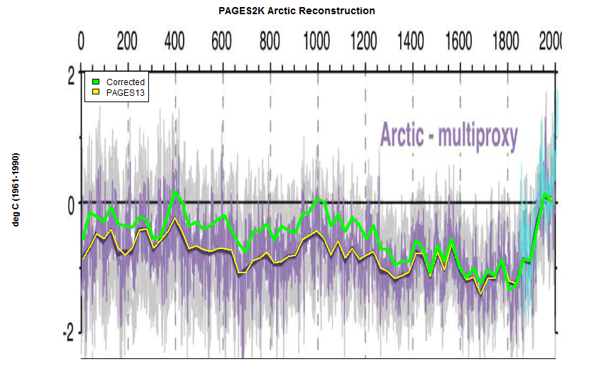
Here is one you might like. This graph shows how the 1,000 year cycle and axial tilt affect earths energy balance. The peak trend is cooling and the general trend is now also cooling. Its going to be rough 600 years for alarmists or maybe longer if we fall into the next glacial cycle.