Arctic ice thins dramatically

Maybe Greenland will become green again. At one point in time they say that the north pole had about the same climate as present day Florida. Anyway if the ice is melting up there we should start drilling for oil which would help mankind more then the ice melting will hurt it. There isn't really a downside.

A very gentle temperature gradient from the equator to the poles meant weaker global winds, contributing to less upwelling and more stagnant oceans than today. This is evidenced by widespread black shale deposition and frequent anoxic events.[12] Sediment cores show that tropical sea surface temperatures may have briefly been as warm as 42 °C (107 °F), 17 °C (31 °F) warmer than at present, and that they averaged around 37 °C (99 °F). Meanwhile deep ocean temperatures were as much as 15 to 20 °C (27 to 36 °F) higher than today's.[13][14]

Cretaceous - Wikipedia, the free encyclopedia

"In the past few years there has been a real shake-up in the conception of what hothouse climates are like. First, it was found that the Tropical regions in hothouse climates are not tightly thermostatted as had been previously thought. Prior indications of a cool tropics turned out to be an artifact of alteration of the chemistry of marine sediments after they were deposited — a nightmare known as diagenesis to paleoceanographers. The tropics are actually quite a bit warmer than today’s tropics. For example, the Eocene tropical ocean may have been as warm as 35C, as compared to about 29C today. The upward revision of tropical temperatures is quite a good thing for the CO2 theory, since it removes a good part of the “low gradient” problem, wherein models were thought to systematically exaggerate the pole to equator temperature gradient." Real climate.

The thing about this period is co2 was as much as 3,000 ppm:eek: Even with the weaker sun, which means less solar energy getting into our climate system. A very hot period.
How do you explain it if not for co2?

Another thing---this would be very bad for life as it is today. No question about it.:( 35c tropics would be to hot for human life.
 
Last edited:

Attachments

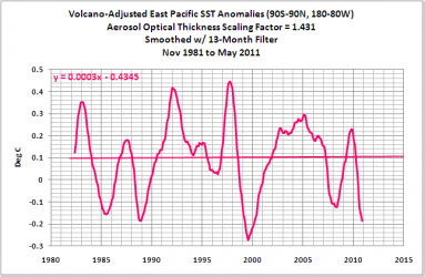
  • $volcano sea surface temps.png
    $volcano sea surface temps.png
    13.4 KB · Views: 13
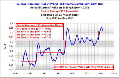
  • $rest of the world.png
    $rest of the world.png
    14.1 KB · Views: 14
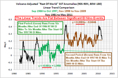
  • $el nino graph.png
    $el nino graph.png
    19.3 KB · Views: 22
Maybe Greenland will become green again. At one point in time they say that the north pole had about the same climate as present day Florida. Anyway if the ice is melting up there we should start drilling for oil which would help mankind more then the ice melting will hurt it. There isn't really a downside.


win

:rock::rock::rock::rock::rock:


Skooks, even if we got greenland, Canada and russia to be new growing area's, but area's like the southern plains and midwest would become much drier, which means they wouldn't be able to be one of the bread baskets of the world. How do we know that greenland, russia and Canada can replace the midwestern United states?

Also drilling for oil within the arctic is all fine and good.
 
Look just north of northeastern russia and you will see close to land that there is NO sea ICE. The northeast passage seems to have opened!!!


The northeast passage allways opens.
 
Look just north of northeastern russia and you will see close to land that there is NO sea ICE. The northeast passage seems to have opened!!!


The northeast passage allways opens.

LOL. Once again Walleyes demonstrates that he is an idiot.

Northern Passages : Weather Underground

In 2007 the Northeast Passage was not open. You had to have an icebreaker for one portion of it. In 2010, two sail boats sailed both the Northwest and the Northeast Passages in one summer. With no help from icebreakers.
 

Ok chris I am tired and want to make this short...

#1 What exactly does the part in parenthesis mean? You know it says this above your chart. "(Area of ocean with at least 15% sea ice)" What exactly does that mean in this context, I am not quite sure on that... Does it mean they only used areas where the ice was 15% of the area by volume of sea water or ice? or what? And if that is indeed what they mean, why not use the whole dam ice area? Wouldn't that be a better way to judge ice extent for the area? And if thats not what they meant please explain to me what in fact they do mean by that.

#2 The third line on the legend text represents 1979 - 2000 average correct? Ok so why did they only do the average to 2000? 10 years are missing and that seems a bit odd to me. I think a continued warming trend would be best represented by a full average up to 2010 if in fact there was drastic warming as they claim... Comparing 2011 ice coverage to 2007 and then comparing them both to an average between 1979 and 2000 while leaving out 9 years between the average and the two years separated by 3 more years between them is incomplete at best and I say a bit suspect...

#3 The part in the legend that says + or - 2 ... So if that is correct and their is a + - of 2 then by looking at 2007 and 2011 and keeping that + or Minus factor of 2 in mind we can safely say the two years separated by 3 years which we do not see represented here, are within the margin of error to make them nearly identical... Which begs the question how does this + or - factor into the 1979 to 2000 average? Was it taken with an assumption of a - 2 or a + 2? If it were a +2 than the average itself would be suspect as well.

You see chris that rather long winded and dull investigation of just the one chart you posted, told me some very basic truths. One; we have a error factor in it of + or -2 which given the fact there is no more than a difference factor of 2 in the years 2007 and 2011, we could very easily say there is no discernible difference in ice coverage between the two years, making the charts implications false in its pretense this years ice is less than 2007. Second, using and average of 21 years, and comparing it to 2 non-consecutive years themselves separated by no less than a total of 9 years after the end point of the average, is unsound scientifically and gives a false impression of the data. And I would say at least a bit dishonest if not by intent, in the very least by misrepresentation.

Dam I went and got all boring and dull again didn't I... LOL ok dude your chart sucks! There now you and olsocks can understand it...:lol:

Damn, the lack of comprehension displayed here is astounding. You didn't finish the third grade.

Answer the questions I asked, and explain the points I raised then MENSA man...:lol:

Socks you have never given that much thought to anything regarding climate change. Do you really think you can dismiss legitimate questions and issues by pretending the person is stupid? Sorry dufus but if you had half the intelligence you claim to have you would have already noticed these issues.
 

Ok chris I am tired and want to make this short...

#1 What exactly does the part in parenthesis mean? You know it says this above your chart. "(Area of ocean with at least 15% sea ice)" What exactly does that mean in this context, I am not quite sure on that... Does it mean they only used areas where the ice was 15% of the area by volume of sea water or ice? or what? And if that is indeed what they mean, why not use the whole dam ice area? Wouldn't that be a better way to judge ice extent for the area? And if thats not what they meant please explain to me what in fact they do mean by that.

#2 The third line on the legend text represents 1979 - 2000 average correct? Ok so why did they only do the average to 2000? 10 years are missing and that seems a bit odd to me. I think a continued warming trend would be best represented by a full average up to 2010 if in fact there was drastic warming as they claim... Comparing 2011 ice coverage to 2007 and then comparing them both to an average between 1979 and 2000 while leaving out 9 years between the average and the two years separated by 3 more years between them is incomplete at best and I say a bit suspect...

#3 The part in the legend that says + or - 2 ... So if that is correct and their is a + - of 2 then by looking at 2007 and 2011 and keeping that + or Minus factor of 2 in mind we can safely say the two years separated by 3 years which we do not see represented here, are within the margin of error to make them nearly identical... Which begs the question how does this + or - factor into the 1979 to 2000 average? Was it taken with an assumption of a - 2 or a + 2? If it were a +2 than the average itself would be suspect as well.

You see chris that rather long winded and dull investigation of just the one chart you posted, told me some very basic truths. One; we have a error factor in it of + or -2 which given the fact there is no more than a difference factor of 2 in the years 2007 and 2011, we could very easily say there is no discernible difference in ice coverage between the two years, making the charts implications false in its pretense this years ice is less than 2007. Second, using and average of 21 years, and comparing it to 2 non-consecutive years themselves separated by no less than a total of 9 years after the end point of the average, is unsound scientifically and gives a false impression of the data. And I would say at least a bit dishonest if not by intent, in the very least by misrepresentation.

Dam I went and got all boring and dull again didn't I... LOL ok dude your chart sucks! There now you and olsocks can understand it...:lol:

I am going to repost this until chris can explain the issues I raised with his chart...
 
07,22,2011,6965156

-70,157 melt today

It is going to be very very close. The pattern broke down and that high was completely replaced with a low pressure area that is forecasted to remind for about a week or so. If we some how beat 2007 with this poor pattern I will be amazed...It will be completely because of the volume being far less.

Here is a temperature anomaly map for the 30th of July.
post-5679-0-72839300-1311374639.png


My guess is in about 3-4 weeks that a new high will build and will take us up to 60-70 thousand a day melts in mid to late August, which case we will likely reclaim our first place for this year. That is just guessing.

bitz_fig2.jpg


2007=4.2 million km, 2010 4.8 million km, 4.76 million km, 2008=4.56, 2009=5.1
We have a negative pdo, which is not as favorable for ice melt either and a nina. We're far below the ipcc models by at least a few years.
 
Last edited:
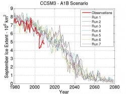
This was made up to 2006. So let me update it to 2010. We're below the projection!

2006=5.8 million km^2
2007 4.2 million km^2
2008 4.56 million km^2
2009 5.1 million km^2
2010 4.76 million km^2

Eyeballing the graph tells me that the "means" model projection for 2010 was near 5.65 million km^2! At the time of the model was made in 2006 it was more like 6.25 million km^2.
 

Attachments

  • $bitz_fig2.jpg
    $bitz_fig2.jpg
    102.7 KB · Views: 16
Last edited:

Ok chris I am tired and want to make this short...

#1 What exactly does the part in parenthesis mean? You know it says this above your chart. "(Area of ocean with at least 15% sea ice)" What exactly does that mean in this context, I am not quite sure on that... Does it mean they only used areas where the ice was 15% of the area by volume of sea water or ice? or what? And if that is indeed what they mean, why not use the whole dam ice area? Wouldn't that be a better way to judge ice extent for the area? And if thats not what they meant please explain to me what in fact they do mean by that.

#2 The third line on the legend text represents 1979 - 2000 average correct? Ok so why did they only do the average to 2000? 10 years are missing and that seems a bit odd to me. I think a continued warming trend would be best represented by a full average up to 2010 if in fact there was drastic warming as they claim... Comparing 2011 ice coverage to 2007 and then comparing them both to an average between 1979 and 2000 while leaving out 9 years between the average and the two years separated by 3 more years between them is incomplete at best and I say a bit suspect...

#3 The part in the legend that says + or - 2 ... So if that is correct and their is a + - of 2 then by looking at 2007 and 2011 and keeping that + or Minus factor of 2 in mind we can safely say the two years separated by 3 years which we do not see represented here, are within the margin of error to make them nearly identical... Which begs the question how does this + or - factor into the 1979 to 2000 average? Was it taken with an assumption of a - 2 or a + 2? If it were a +2 than the average itself would be suspect as well.You see chris that rather long winded and dull investigation of just the one chart you posted, told me some very basic truths. One; we have a error factor in it of + or -2 which given the fact there is no more than a difference factor of 2 in the years 2007 and 2011, we could very easily say there is no discernible difference in ice coverage between the two years, making the charts implications false in its pretense this years ice is less than 2007. Second, using and average of 21 years, and comparing it to 2 non-consecutive years themselves separated by no less than a total of 9 years after the end point of the average, is unsound scientifically and gives a false impression of the data. And I would say at least a bit dishonest if not by intent, in the very least by misrepresentation.

Dam I went and got all boring and dull again didn't I... LOL ok dude your chart sucks! There now you and olsocks can understand it...:lol:

Would someone kindly explain to poor ol' g-string what standard deviation means.

Okay MENSA man I am now going to have to show how completely ignorant you are.. AGAIN!

+ or - 2 standard deviation is what I was referring to you imbecile. Using that standard we can add or subtract 2 from the graph lines and still be within tolerances. Thats why they have that standard deviation so they have room for error. Using that we can see plainly that there is very little if any difference in the years shown on that graph. My questions were in regards to how they used that standard deviation and its application to the average they use to compare the other two years.

Now I am done explaining this to the self-proclaimed affiliate of MENSA, who should in the very least be able to follow a simple analysis of a graph and points raised.

Come on MENSA man you should be able to answer my questions if your friends to cowardly to do so...
 
When I participated in a NASA media conference call on Sept 22, 2008, I learned that NASA was announcing the findings from the satellite Ulysses after its 18 year voyage studying the Sun. The Ulysses passed the Sun three times. The first pass was during a solar minimum (a period of lower activity). The second pass of the Sun was during a solar maximum and the third pass during a less active period similar to the first pass (solar cycle 23). They noticed large differences between the two minimums, that on the third pass the Sun was emitting much less energy than the first pass, and the lowest amount of solar energy ever recorded (since the beginning of modern measurement with the advent of the space program). This only confirms my suspicion that the Sun is the primary driver of the world's temperatures and not mankind. This explains the warming of the 1980's and 1990's and for the last eight years, continuously cooling temperatures


:)


I used to believe this crap, but now understand 2008 for what it was as a goddamn nina year that matches 1976 in many ways, but anyways what is more important is the general trend of things. Truth is we're going to get internal changes within our climate systems like the enso, pdo, amo, ao, ect. There is no cooling, I can tell you that much. Hell we could see another little ice age set up on our sun and I doubt we could cool this fucker down now as we're very close to a dalton set up now. Just watch!:cool:
 
Last edited:
Well, in my neck of the woods it sure is cooling. Short summers and long cold winters with tons of snow. There is still snow all over the mountains today wherever you look. I only dream about the warm days of summer anymore. I say heat this mother up a little bit. :)
 
ok chris i am tired and want to make this short...

#1 what exactly does the part in parenthesis mean? You know it says this above your chart. "(area of ocean with at least 15% sea ice)" what exactly does that mean in this context, i am not quite sure on that... Does it mean they only used areas where the ice was 15% of the area by volume of sea water or ice? Or what? And if that is indeed what they mean, why not use the whole dam ice area? Wouldn't that be a better way to judge ice extent for the area? And if thats not what they meant please explain to me what in fact they do mean by that.

#2 the third line on the legend text represents 1979 - 2000 average correct? Ok so why did they only do the average to 2000? 10 years are missing and that seems a bit odd to me. I think a continued warming trend would be best represented by a full average up to 2010 if in fact there was drastic warming as they claim... Comparing 2011 ice coverage to 2007 and then comparing them both to an average between 1979 and 2000 while leaving out 9 years between the average and the two years separated by 3 more years between them is incomplete at best and i say a bit suspect...

#3 the part in the legend that says + or - 2 ... So if that is correct and their is a + - of 2 then by looking at 2007 and 2011 and keeping that + or minus factor of 2 in mind we can safely say the two years separated by 3 years which we do not see represented here, are within the margin of error to make them nearly identical... Which begs the question how does this + or - factor into the 1979 to 2000 average? Was it taken with an assumption of a - 2 or a + 2? If it were a +2 than the average itself would be suspect as well.you see chris that rather long winded and dull investigation of just the one chart you posted, told me some very basic truths. One; we have a error factor in it of + or -2 which given the fact there is no more than a difference factor of 2 in the years 2007 and 2011, we could very easily say there is no discernible difference in ice coverage between the two years, making the charts implications false in its pretense this years ice is less than 2007. Second, using and average of 21 years, and comparing it to 2 non-consecutive years themselves separated by no less than a total of 9 years after the end point of the average, is unsound scientifically and gives a false impression of the data. And i would say at least a bit dishonest if not by intent, in the very least by misrepresentation.

Dam i went and got all boring and dull again didn't i... Lol ok dude your chart sucks! There now you and olsocks can understand it...:lol:

would someone kindly explain to poor ol' g-string what standard deviation means.

okay mensa man i am now going to have to show how completely ignorant you are.. Again!

+ or - 2 standard deviation is what i was referring to you imbecile. Using that standard we can add or subtract 2 from the graph lines and still be within tolerances. Thats why they have that standard deviation so they have room for error. Using that we can see plainly that there is very little if any difference in the years shown on that graph. My questions were in regards to how they used that standard deviation and its application to the average they use to compare the other two years.

Now i am done explaining this to the self-proclaimed affiliate of mensa, who should in the very least be able to follow a simple analysis of a graph and points raised.

Come on mensa man you should be able to answer my questions if your friends to cowardly to do so...

lol!!!!
 
When I participated in a NASA media conference call on Sept 22, 2008, I learned that NASA was announcing the findings from the satellite Ulysses after its 18 year voyage studying the Sun. The Ulysses passed the Sun three times. The first pass was during a solar minimum (a period of lower activity). The second pass of the Sun was during a solar maximum and the third pass during a less active period similar to the first pass (solar cycle 23). They noticed large differences between the two minimums, that on the third pass the Sun was emitting much less energy than the first pass, and the lowest amount of solar energy ever recorded (since the beginning of modern measurement with the advent of the space program). This only confirms my suspicion that the Sun is the primary driver of the world's temperatures and not mankind. This explains the warming of the 1980's and 1990's and for the last eight years, continuously cooling temperatures


:)

Fucking dumb, Big-Foot-in-Mouth.

UAH Global Temperature Update for June, 2011: +0.31 deg. C « Roy Spencer, Ph. D.

Now look at the graph from this site. Does that look like a cooling for the last eight years? Do you practice telling dumb easy pointed out lies?
 

Forum List

Back
Top