Climate change: 2015 will be the hottest year on record 'by a mile', experts say

Climate Change
An Information Statement of the American Meteorological Society
(Adopted by AMS Council 20 August 2012)

pdf version

The following is an AMS Information Statement intended to provide a trustworthy, objective, and scientifically up-to-date explanation of scientific issues of concern to the public at large.

Background

This statement provides a brief overview of how and why global climate has changed over the past century and will continue to change in the future. It is based on the peer-reviewed scientific literature and is consistent with the vast weight of current scientific understanding as expressed in assessments and reports from the Intergovernmental Panel on Climate Change, the U.S. National Academy of Sciences, and the U.S. Global Change Research Program. Although the statement has been drafted in the context of concerns in the United States, the underlying issues are inherently global in nature.

How is climate changing?

Warming of the climate system now is unequivocal, according to many different kinds of evidence. Observations show increases in globally averaged air and ocean temperatures, as well as widespread melting of snow and ice and rising globally averaged sea level. Surface temperature data for Earth as a whole, including readings over both land and ocean, show an increase of about 0.8°C (1.4°F) over the period 1901─2010 and about 0.5°C (0.9°F) over the period 1979–2010 (the era for which satellite-based temperature data are routinely available). Due to natural variability, not every year is warmer than the preceding year globally. Nevertheless, all of the 10 warmest years in the global temperature records up to 2011 have occurred since 1997, with 2005 and 2010 being the warmest two years in more than a century of global records. The warming trend is greatest in northern high latitudes and over land. In the U.S., most of the observed warming has occurred in the West and in Alaska; for the nation as a whole, there have been twice as many record daily high temperatures as record daily low temperatures in the first decade of the 21st century.

The effects of this warming are especially evident in the planet’s polar regions. Arctic sea ice extent and volume have been decreasing for the past several decades. Both the Greenland and Antarctic ice sheets have lost significant amounts of ice. Most of the world’s glaciers are in retreat.

Other changes, globally and in the U.S., are also occurring at the same time. The amount of rain falling in very heavy precipitation events (the heaviest 1% of all precipitation events) has increased over the last 50 years throughout the U.S. Freezing levels are rising in elevation, with rain occurring more frequently instead of snow at mid-elevations of western mountains. Spring maximum snowpack is decreasing, snowmelt occurs earlier, and the spring runoff that supplies over two-thirds of western U.S. streamflow is reduced. Evidence for warming is also observed in seasonal changes across many areas, including earlier springs, longer frost-free periods, longer growing seasons, and shifts in natural habitats and in migratory patterns of birds and insects.

My goodness, this statement is three years old. How terribly out of date, right?


And every year we have fewer and fewer days where we break 100 degrees. In fact last year was the first time in 25 years where we never once broke 100 degrees.
Link?


National Weather Service
Severe Storms Possible Northern Plains
Heavy rain and localized flash flooding are also possible in the northern Plains and portions of Florida. Elevated fire weather conditions continue in the Great Basin and Intermountain West. Meanwhile, rain and high elevation snow will impact the Pacific and Interior Northwest.

And?
 
Hottest and driest summer in Spokane ever

SPOKANE, Wash. - The period from June 1 through Aug. 31 was the hottest and driest summer on record in Spokane.

Reports said the hot and dry conditions caused extreme drought and big wildfires that still are burning across the region.

The average daily temperature this summer was 72.7 degrees, which is derived from adding up all the daytime highs and nighttime lows. The previous record, 71.3 degrees, was set in 1922.

Normal for the three-month period is 67 degrees.

Very hot for Spokane, as well.
 
Go find a consensus TODAY... It doesn't exist.. Unless the questions are juvenile and unimportant.. Like is the climate changing? Or does man "have a role" in that change.

A consensus certainly exists today. And it's stronger than its been in the past. Look at the last IPCC. Heck- glance at any scientific journal, from the top ones to Scientific American- they all agree with the NAS, AGU, and the AAAS.

You're living in the hottest year of the hottest decade ever directly recorded. And it was predicted almost 30 years ago, fairly closely. That's pretty good evidence right there.

It was predicted 30 years ago fool?

Post a link?

And if you say you are a "scientist"

Give me day to day data of the oceans temperature between 1870 (when great Britains challenger was launched to for that one year cruise )~ 2004 when we started monitoring the oceans temperatures
Well, here's an even older one, from about 35 years ago.

http://m.sciencemag.org/content/213/4511/957

Here's a good explanation of what it looked like decades later, written by climatologists:

Evaluating a 1981 temperature projection

Evaluating a 1981 temperature projection
 
Looks to me like the point estimates and error bars are solidly in the range of the AR4 projections, and as we know now, the last two years have been record anomalies, thus putting them well into the 'orange'. In fact, most of those datapoints fall into the ranges of ALL the IPCC projections, if you look at the far right.

I love how you think there was some conspiracy to make the graph look better, when its pretty clear its in line with the latest IPCC projections. That's an interesting spin. Had to come from some nutjob like Watts, not an actual scientist.


Do you actually doubt that it came from the IPCC? Hahahahaha.
No, did I say that?

Did you miss the part about how the graph actually shows good correlation with predictions?

Do you even understand the graph you posted??
 
threegoofs is a newbie who doesn't know much of anything but what the gullible press spoonfeeds the public. As is evident by his posts and responses.
Yet you post a graph you don't understand and interpret it wrong.
 
FOX 12 Weather Blog

It’s The Hottest Summer Ever Recorded In Portland

August 31, 2015
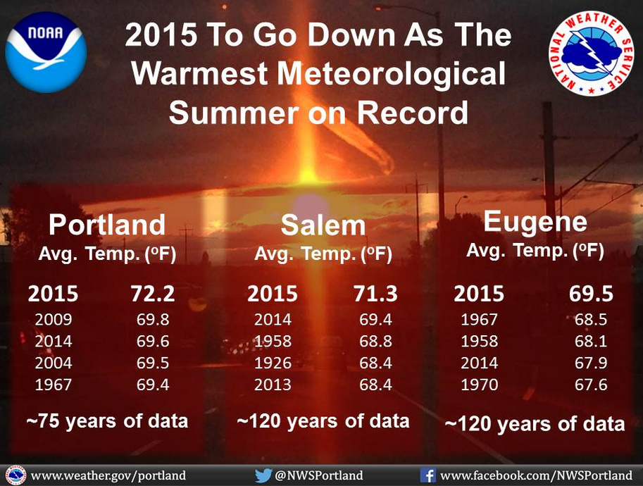
You just survived the hottest summer (by far) we’ve seen here in Portland. The numbers:


Here is one more graphic NWS just put on their Facebook page…looks like you folks in Salem and Eugene saw your hottest too!


Portland was warm, also.


How many days in a row did you have temps over 100? Way back in 1941 you had 5. The most ever recorded. Seems to me that your meteorologists are ignoring some records there....

From July 13 to 17 in 1941, there were five consecutive days of highs of 100 degrees or higher, making it the longest consecutive streak of 100-degree or higher days since record-keeping began at Portland International Airport in October 1940.


Extended heat wave, with possible 100-degree days, high humidity, next week in Portland forecast (video)
 
Looks to me like the point estimates and error bars are solidly in the range of the AR4 projections, and as we know now, the last two years have been record anomalies, thus putting them well into the 'orange'. In fact, most of those datapoints fall into the ranges of ALL the IPCC projections, if you look at the far right.

I love how you think there was some conspiracy to make the graph look better, when its pretty clear its in line with the latest IPCC projections. That's an interesting spin. Had to come from some nutjob like Watts, not an actual scientist.

There WAS severe monkey biz pissed on that chart. Anyone that can drive MS Office can tell how to scale graphs and pad them to accentuate or attenuate features of the data. Putting an irrelevent 100 years of past temperature on the left side in the final version made the errors look smaller by a factor of five. No conspiracy.. 30+ years of science and engineering tells me that.. And THEN -- cutting off the projections to go ONLY to 2015 instead of continuing them out as ORIGINALLY PRESENTED -- was done for spite and to avoid major embarrassment. If ya WANT --- I'll show you the originals and put those actual temps on top of it.. But if you're really in science -- you would already KNOW how to lie with graphs and statistics.. Or defend yourself against those that play to lie with graphs and statistics..

If you think that the very tops of those errors hitting SOME of the projected region is a true wonder and success -- you need to realize that the temp. data ends in 2010 (?) when the report came out. And since then --- the temps have walked off of ALL of those estimates..

This is nonsensical. The data and ranges clearly fall in the ranges that were predicted, aside from a few outlier years, which is to be expected in the short run.

Temps have generally been higher since 2010, so we can be sure that most of those years will be well into the predicted range.

All in all, an excellent graph.

See, only people who can't interpret data think that the look of the graph matters. The data is the data, and that data shows remarkable correlation between predicted ranges and observed temps.
 
You stated that their statements were out of date, and did not reflect current knowledge. Is the statement from the Royal Society up to date enough for you? 21July15.

Then you want to call these statements just press releases. Well of course, that is what you create a statement for, to release to the general public through the press what the consensus of opinion is on a subject within that Scientific Society.

Wow.

I've seen some bad deniers on some boards, but these guys take the cake.
 
Climate Change
An Information Statement of the American Meteorological Society
(Adopted by AMS Council 20 August 2012)

pdf version

The following is an AMS Information Statement intended to provide a trustworthy, objective, and scientifically up-to-date explanation of scientific issues of concern to the public at large.

Background

This statement provides a brief overview of how and why global climate has changed over the past century and will continue to change in the future. It is based on the peer-reviewed scientific literature and is consistent with the vast weight of current scientific understanding as expressed in assessments and reports from the Intergovernmental Panel on Climate Change, the U.S. National Academy of Sciences, and the U.S. Global Change Research Program. Although the statement has been drafted in the context of concerns in the United States, the underlying issues are inherently global in nature.

How is climate changing?

Warming of the climate system now is unequivocal, according to many different kinds of evidence. Observations show increases in globally averaged air and ocean temperatures, as well as widespread melting of snow and ice and rising globally averaged sea level. Surface temperature data for Earth as a whole, including readings over both land and ocean, show an increase of about 0.8°C (1.4°F) over the period 1901─2010 and about 0.5°C (0.9°F) over the period 1979–2010 (the era for which satellite-based temperature data are routinely available). Due to natural variability, not every year is warmer than the preceding year globally. Nevertheless, all of the 10 warmest years in the global temperature records up to 2011 have occurred since 1997, with 2005 and 2010 being the warmest two years in more than a century of global records. The warming trend is greatest in northern high latitudes and over land. In the U.S., most of the observed warming has occurred in the West and in Alaska; for the nation as a whole, there have been twice as many record daily high temperatures as record daily low temperatures in the first decade of the 21st century.

The effects of this warming are especially evident in the planet’s polar regions. Arctic sea ice extent and volume have been decreasing for the past several decades. Both the Greenland and Antarctic ice sheets have lost significant amounts of ice. Most of the world’s glaciers are in retreat.

Other changes, globally and in the U.S., are also occurring at the same time. The amount of rain falling in very heavy precipitation events (the heaviest 1% of all precipitation events) has increased over the last 50 years throughout the U.S. Freezing levels are rising in elevation, with rain occurring more frequently instead of snow at mid-elevations of western mountains. Spring maximum snowpack is decreasing, snowmelt occurs earlier, and the spring runoff that supplies over two-thirds of western U.S. streamflow is reduced. Evidence for warming is also observed in seasonal changes across many areas, including earlier springs, longer frost-free periods, longer growing seasons, and shifts in natural habitats and in migratory patterns of birds and insects.

My goodness, this statement is three years old. How terribly out of date, right?


And every year we have fewer and fewer days where we break 100 degrees. In fact last year was the first time in 25 years where we never once broke 100 degrees.
Thanks for letting us know about your weather.

Maybe there is a local weather forum you can join.
 
Looks to me like the point estimates and error bars are solidly in the range of the AR4 projections, and as we know now, the last two years have been record anomalies, thus putting them well into the 'orange'. In fact, most of those datapoints fall into the ranges of ALL the IPCC projections, if you look at the far right.

I love how you think there was some conspiracy to make the graph look better, when its pretty clear its in line with the latest IPCC projections. That's an interesting spin. Had to come from some nutjob like Watts, not an actual scientist.

There WAS severe monkey biz pissed on that chart. Anyone that can drive MS Office can tell how to scale graphs and pad them to accentuate or attenuate features of the data. Putting an irrelevent 100 years of past temperature on the left side in the final version made the errors look smaller by a factor of five. No conspiracy.. 30+ years of science and engineering tells me that.. And THEN -- cutting off the projections to go ONLY to 2015 instead of continuing them out as ORIGINALLY PRESENTED -- was done for spite and to avoid major embarrassment. If ya WANT --- I'll show you the originals and put those actual temps on top of it.. But if you're really in science -- you would already KNOW how to lie with graphs and statistics.. Or defend yourself against those that play to lie with graphs and statistics..

If you think that the very tops of those errors hitting SOME of the projected region is a true wonder and success -- you need to realize that the temp. data ends in 2010 (?) when the report came out. And since then --- the temps have walked off of ALL of those estimates..

This is nonsensical. The data and ranges clearly fall in the ranges that were predicted, aside from a few outlier years, which is to be expected in the short run.

Temps have generally been higher since 2010, so we can be sure that most of those years will be well into the predicted range.

All in all, an excellent graph.

See, only people who can't interpret data think that the look of the graph matters. The data is the data, and that data shows remarkable correlation between predicted ranges and observed temps.


No they haven't. Temp levels have flatlined for the last 18 years. Only through the magic of computer derived science fiction do climatologists come up with fanciful tales of .38 degree rises in temperature. A number that is not measurable in the real world.
No, temperatures have increased.

You must be referring to the RSS satellite data set, the one that cuts off the upper latitudes and southern latitudes and measures the upper troposphere rather than the surface.

But you don't know the difference or care, because deniers tell you it's not warming.

Scientists who study this are pretty clear.
 
Climate Change
An Information Statement of the American Meteorological Society
(Adopted by AMS Council 20 August 2012)

pdf version

The following is an AMS Information Statement intended to provide a trustworthy, objective, and scientifically up-to-date explanation of scientific issues of concern to the public at large.

Background

This statement provides a brief overview of how and why global climate has changed over the past century and will continue to change in the future. It is based on the peer-reviewed scientific literature and is consistent with the vast weight of current scientific understanding as expressed in assessments and reports from the Intergovernmental Panel on Climate Change, the U.S. National Academy of Sciences, and the U.S. Global Change Research Program. Although the statement has been drafted in the context of concerns in the United States, the underlying issues are inherently global in nature.

How is climate changing?

Warming of the climate system now is unequivocal, according to many different kinds of evidence. Observations show increases in globally averaged air and ocean temperatures, as well as widespread melting of snow and ice and rising globally averaged sea level. Surface temperature data for Earth as a whole, including readings over both land and ocean, show an increase of about 0.8°C (1.4°F) over the period 1901─2010 and about 0.5°C (0.9°F) over the period 1979–2010 (the era for which satellite-based temperature data are routinely available). Due to natural variability, not every year is warmer than the preceding year globally. Nevertheless, all of the 10 warmest years in the global temperature records up to 2011 have occurred since 1997, with 2005 and 2010 being the warmest two years in more than a century of global records. The warming trend is greatest in northern high latitudes and over land. In the U.S., most of the observed warming has occurred in the West and in Alaska; for the nation as a whole, there have been twice as many record daily high temperatures as record daily low temperatures in the first decade of the 21st century.

The effects of this warming are especially evident in the planet’s polar regions. Arctic sea ice extent and volume have been decreasing for the past several decades. Both the Greenland and Antarctic ice sheets have lost significant amounts of ice. Most of the world’s glaciers are in retreat.

Other changes, globally and in the U.S., are also occurring at the same time. The amount of rain falling in very heavy precipitation events (the heaviest 1% of all precipitation events) has increased over the last 50 years throughout the U.S. Freezing levels are rising in elevation, with rain occurring more frequently instead of snow at mid-elevations of western mountains. Spring maximum snowpack is decreasing, snowmelt occurs earlier, and the spring runoff that supplies over two-thirds of western U.S. streamflow is reduced. Evidence for warming is also observed in seasonal changes across many areas, including earlier springs, longer frost-free periods, longer growing seasons, and shifts in natural habitats and in migratory patterns of birds and insects.

My goodness, this statement is three years old. How terribly out of date, right?


And every year we have fewer and fewer days where we break 100 degrees. In fact last year was the first time in 25 years where we never once broke 100 degrees.
Thanks for letting us know about your weather.

Maybe there is a local weather forum you can join.


Maybe you can present something that isn't pure propaganda? I understand that you wish to do everything your masters tell you to do, but the rest of us actually care about science and the scientific method. Let us know when you all stop demanding virgin sacrifices and return to real science. M'kay...
 
Looks to me like the point estimates and error bars are solidly in the range of the AR4 projections, and as we know now, the last two years have been record anomalies, thus putting them well into the 'orange'. In fact, most of those datapoints fall into the ranges of ALL the IPCC projections, if you look at the far right.

I love how you think there was some conspiracy to make the graph look better, when its pretty clear its in line with the latest IPCC projections. That's an interesting spin. Had to come from some nutjob like Watts, not an actual scientist.

There WAS severe monkey biz pissed on that chart. Anyone that can drive MS Office can tell how to scale graphs and pad them to accentuate or attenuate features of the data. Putting an irrelevent 100 years of past temperature on the left side in the final version made the errors look smaller by a factor of five. No conspiracy.. 30+ years of science and engineering tells me that.. And THEN -- cutting off the projections to go ONLY to 2015 instead of continuing them out as ORIGINALLY PRESENTED -- was done for spite and to avoid major embarrassment. If ya WANT --- I'll show you the originals and put those actual temps on top of it.. But if you're really in science -- you would already KNOW how to lie with graphs and statistics.. Or defend yourself against those that play to lie with graphs and statistics..

If you think that the very tops of those errors hitting SOME of the projected region is a true wonder and success -- you need to realize that the temp. data ends in 2010 (?) when the report came out. And since then --- the temps have walked off of ALL of those estimates..

This is nonsensical. The data and ranges clearly fall in the ranges that were predicted, aside from a few outlier years, which is to be expected in the short run.

Temps have generally been higher since 2010, so we can be sure that most of those years will be well into the predicted range.

All in all, an excellent graph.

See, only people who can't interpret data think that the look of the graph matters. The data is the data, and that data shows remarkable correlation between predicted ranges and observed temps.


No they haven't. Temp levels have flatlined for the last 18 years. Only through the magic of computer derived science fiction do climatologists come up with fanciful tales of .38 degree rises in temperature. A number that is not measurable in the real world.
No, temperatures have increased.

You must be referring to the RSS satellite data set, the one that cuts off the upper latitudes and southern latitudes and measures the upper troposphere rather than the surface.

But you don't know the difference or care, because deniers tell you it's not warming.

Scientists who study this are pretty clear.


Bullshit. The amount of increase that is claimed is so slight that it is impossible for the tools we have to measure that fine. Period. The only way they can come up with those silly reports is to massage the raw data through their computers and voila! They have whatever bullshit number they want. But the numbers are still that...bullshit. Not born out by fact.
You're one of those.. *sigh*
 
perature (LT) anomaly for August, 2015 is +0.28 deg. C, up from the July, 2015 value of +0.18 deg. C (click for full size version):


Now I don't agree with this graph, but even by it, the last eighteen years are definately the warmest on the chart. By other measurements, 1998, 2005, 2010, and 2014 were about equal. 2015 will blow them all away.

See Why 2015 May Be the Hottest Year Ever

See Why 2015 May Be the Hottest Year Ever


See Why 2015 May Be the Hottest Year Ever
Already, the first six months of 2015 have been the hottest on record.

Anomaly of land and ocean temperature, June 2015
Based on 1981-2010 average.
key.ngsversion.1437694577539.jpg

5ºC
(9ºF)
0ºC
(0ºF)
-5ºC
(-9ºF)
Hottest_June_Winkel-Artboard_2.ngsversion.1437695607859.png


2010
Hottest_June_Winkel_smallz_2010.ngsversion.1437696277796.jpg

2005
Hottest_June_Winkel_smallz_2005.ngsversion.1437696964793.jpg

2000
Hottest_June_Winkel_smallz_2000.ngsversion.1437696964438.jpg

NG STAFF
SOURCE: NOAA NATIONAL CENTERS FOR ENVIRONMENTAL INFORMATION, STATE OF THE CLIMATE: GLOBAL ANALYSIS FOR JUNE 2015

By Brian Clark Howard
Graphics by Lauren James, Chiqui Esteban, National Geographic
PUBLISHED FRI JUL 24 12:20:06 EDT 2015

summer has felt like a scorcher in many parts of the world, and now scientists have the data to prove it.

June land- and ocean-temperature anomalies
Based on 1881-2015 average
Globally, it's the hottest ever recorded...
The 12-month variation of the temperature in June 2015 is almost 1.5°F above average—the highest ever.


Globally, it's the hottest ever recorded...
The 12-month variation of the temperature in June 2015 is almost 1.5°F above average—the highest ever.
 
[
Bullshit. The amount of increase that is claimed is so slight that it is impossible for the tools we have to measure that fine. Period. The only way they can come up with those silly reports is to massage the raw data through their computers and voila! They have whatever bullshit number they want. But the numbers are still that...bullshit. Not born out by fact.
Love the confident statements.

But I would trust a link more.

And let's make it a scientific link, not some denier website.
 
Ah, so all these scientfic societies are in on a huge conspiracy or committing scientific fraud. Somehow, this just doesn't make sense.

Did not say that.. The societal endorsement however means about as much as NASCAR pledging to go green. (Oh you didn't mean "start the race"??) They didn't ask the team owners or drivers until AFTER the campaign was designed and launched.. In this case --- those scientific orgs NEVER involved the membership in those statements and if they DID -- you would have heard about the debates --- like you did with Australia Geophysical Union..
 

Forum List

Back
Top