Test out the new USMB Skin - Feedback appreciated

Good feedback.

Keep in mind, elchorizo, that most of us here are older, maybe in our 60s and 70s; some in their 80s---- and the v2 skin was harder to read than the old v1 skin changed circa 2020, and this new skin is even harder for us to read yet. Maybe the new skin appeals more to younger eyes or people using smartphones!
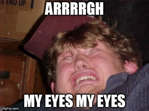
 
1amyeyes.jpg


Too bright. Font looks kinda funky, too.
 
Last edited:
I like the new skin. It works very well in dark mode and I'm often outside. :thup:
 
Keep in mind, elchorizo, that most of us here are older, maybe in our 60s and 70s; some in their 80s---- and the v2 skin was harder to read than the old v1 skin changed circa 2020, and this new skin is even harder for us to read yet. Maybe the new skin appeals more to younger eyes or people using smartphones!

I've just bumped up the font sizes 1px across all font categories.
 
I've been on the phone for the last hour with the USMB call center. I keep yelling "Re-pre-sen-ta-tive!" Nothing, but the annoying out-of-pitch elevator music with static. Just like a typical government office. Oh well.
:dunno:

Listen to this song, good hold music. I used this at my previous business as hold music.

 
I don't hate the new look, but I prefer the old. It does whittle down the avatar from the old square format to a smaller circle. Like Wendy's says "we don't cut corners" and now I see why the square burgers are better. LOL. (laughing at my lame joke)

Even if I go back to the old format, I have to be aware of signature lines and images for those using the new format.
 

Forum List

Back
Top