SSDD
Gold Member
- Nov 6, 2012
- 16,672
- 1,966
- 280
Odd that Ian can express such low opinions of SSDD's ability to reason and his understanding of basic science, yet laugh with him when they think they've been clever. I never realized I could be such a unifying influence.
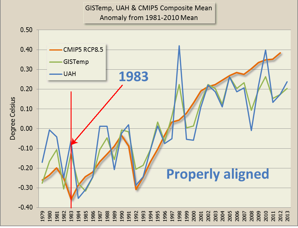
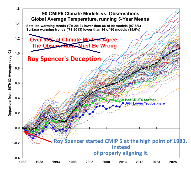
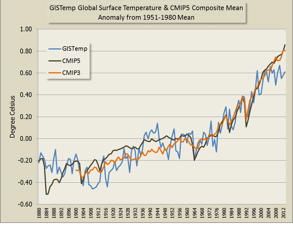
Tell us Ian, why did the slope of the observations change at the indicated point?
You would probably need to ask the guys who wrote the failing models.