Hottest year on record-

So, even after having seen 40 graphs of it, you still insist "The Physical Science Basis" contains no empirical evidence of AGW. You are the one who is lying here and everyone... EVERYONE knows it.

I have seen the graphs...and none of them support the AGW hypothesis...but it has become more clear to me why you and yours have been taken in by the scam...you simply aren't smart enough to understand the topic...for example...you posted this graph as evidence of AGW...

harries_radiation.gif


When in fact, the graph the authors of the study used was this:

spectra2.gif


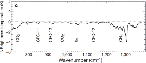
And what the graph is actually showing is that the claims made by the AGW hypothesis are simply not happening... The red and blue lines are measurements taken by the IRIS instrument in 1970 on the Nimbus 4 spacecraft...the black line is the measurement taken by the IMG instrument on the Japanese ADEOS satellite in 1997...over a single location in the central pacific with no clouds...As you can see, in the CO2 band, the two are damned near identical after 27 years of steady atmospheric CO2 increase....In fact, the differences are so slight that they fall within the margin of error of the instruments themselves....The `spectral range' is given as 600-3,000 for IMG, and 400-1,600 for IRIS.....The `spatial field of view' is given as 8 km x 8 km for IMG, 100 km x 100 km for IRIS.....The `spectral resolution' is given as 0.1 to 0.25 for IMG, 2.8 for IRIS..the differences between the instruments are so different that some variation between their measurements is inevitable....

Far from being empirical evidence that the AGW hypothesis is correct...it is empirical evidence that the AGW hypothesis is terribly flawed...

Such fundamental errors in understanding are rife within the believer cult...it is little wonder that they have been able to convince you with so much smoke and mirrors...hell, you can't even look at a simple graph and grasp what it is saying...or you are just a f'ing liar and will post any amount of bullshit in an attempt to fool someone into your cult...


My plot came directly from www.ipcc.ch. What is the source of yours?

His plot came directly from the work itself as he posted... but you failed to read..or are intentionally obtuse about...

He doesn't read...and he doesn't understand any of this.....he depends on cult priests to spoon feed him his talking points....the very idea that he has any sort of education in the hard science of engineering is just laughable...but maybe he does....just as someone always graduates at the top of the class....someone always has to be at the bottom of the class and scrapes by the skin of their teeth....and in the educational environment today where you don't actually have to learn anything in order to progress, I guess it is entirely possible...maybe his parents have money and bought him a degree at a private school...
Where did you get your PhD in Climate Science?

Its Atmospheric Physics moron.. Climatologist is a bastardized conglomeration of soft sciences..
 
It does matter. You are claiming you can read these graphs & charts & know what they mean.

I feel genuinely sorry for you if the educational system has failed you that miserably, that you can't read a graph and know what it means..the complete explanation of the graph is written right there...all you have to do is read it and look at the appropriate lines...if you can't do that...and must depend on someone else to do it for you, then frankly, you are uneducated... Here..let me help. this is the graph in question..

spectra2.gif


The graph is actually showing readings taken by two satellites of the infrared radiation leaving the earth at the top of the atmosphere...one was taken back in 1970, the other in 2006...The red/blue line in 2006 and the black line in 1970. They were both taken over the same area in the central pacific under cloudless conditions.. The AGW hypothesis claims predicts that increasing CO2 in the atmosphere will cause less radiation in the CO2 emission wavelength to exit the earth at the top of the atmosphere...thus causing warming....What the graph shows is that after 36 years of steadily increasing CO2 in the atmosphere, there is actually little difference between the two...In fact, the differences are so slight that they fall within the margin of error of the instruments themselves....The `spectral range' is given as 600-3,000 for IMG, and 400-1,600 for IRIS.....The `spatial field of view' is given as 8 km x 8 km for IMG, 100 km x 100 km for IRIS.....The `spectral resolution' is given as 0.1 to 0.25 for IMG, 2.8 for IRIS..the differences between the instruments are so different that some variation between their measurements is inevitable....

So again...which part of my statement do you have a problem with? If you are unable to read the graph for yourself, you actually have no basis whatsoever to argue at all...you are an uneducated faithful warmer who has come to your position based on your politics and not any particular scientific knowledge....your position is one of ignorance.

Now you tells you know nothing about Climate science & nothing about science. Do you even have a degree? A high school diploma? You brought up this subject. Don't run away from it.

I said that I don't have a PhD in climate science...I didn't say that I know nothing about science...that is you just making things up because apparently in addition to not being able to read a graph..you can't read words and understand what is being said either.

I have a BS in chemistry from UF in Gainesville, Fl....although I don't work in the field. But one doesn't need a degree to read graphs...hell, anyone of my generation who got as far as the 9th grade should be able to read the graph under this discussion...it isn't the least bit complicated.

I'll put mu educatiuon against your any day.

And yet...you can't read and understand a simple graph. You must define education very differently from me. A good education doesn't just teach you facts...it teaches you to think critically...to learn and expand your knowledge every day...

Maybe you have never heard of the people who were completely uneducated that vastly improved our understanding of science....

Michael Faraday for example...one of the most influential people of all time in science and yet he had no formal education at all....

How about William Herschel....he was a musician...played oboe and cello..had no scientific education at all...discoverd several moons and a planet..and not having a telescope...he learned the necessary skills to make his own...lenses and all.

Or Mary Anning...she was just a virtually illiterate sea shell hunter who played a great part in convincing the world that dinosaurs were an actual thing...

And the list could continue practically ad nauseum... I genuinely feel sorry for you if you believe that because you aren't a climate scientist that you can't read graphs and such and grasp their meaning...and that you can't look at research and make heads or tails of it.

By the way...as an afterthought...look again at the graph above...see the red above the black in the wavelengths 750 and 1150...those tell you that the observation made in 2006 shows that in those wavelengths, there is more IR exiting at the top of the atmosphere...precisely the opposite of what the AGW hypothesis predicts... And in real science, if a hypothesis fails a single prediction, it is scrapped and a new hypothesis is developed...the AGW hypothesis has a string of failed predictions going back decades...
 
Here is the Abstract to the Nature article from which that graphic comes (my previous statement that it came from www.ipcc.ch was incorrect). I picked that graphic up from Skeptical Science.com

Increases in greenhouse forcing inferred from the outgoing longwave radiation spectra of the Earth in 1970 and 1997
John E. Harries, Helen E. Brindley, Pretty J. Sagoo & Richard J. Bantges

  1. Space and Atmospheric Physics Group, Blackett Laboratory, Imperial College, London SW7 2BW, UK
Correspondence to: John E. Harries Correspondence and requests for materials should be addressed to J.E.H. (e-mail: Email: [email protected]).


Topof page
The evolution of the Earth's climate has been extensively studied1, 2, and a strong link between increases in surface temperatures and greenhouse gases has been established3, 4. But this relationship is complicated by several feedback processes—most importantly the hydrological cycle—that are not well understood5, 6, 7. Changes in the Earth's greenhouse effect can be detected from variations in the spectrum of outgoing longwave radiation8, 9, 10, which is a measure of how the Earth cools to space and carries the imprint of the gases that are responsible for the greenhouse effect11, 12, 13. Here we analyse the difference between the spectra of the outgoing longwave radiation of the Earth as measured by orbiting spacecraft in 1970 and 1997. We find differences in the spectra that point to long-term changes in atmospheric CH4, CO2 and O3 as well as CFC-11 and CFC-12. Our results provide direct experimental evidence for a significant increase in the Earth's greenhouse effect that is consistent with concerns over radiative forcing of climate.

He doesn't seem to agree with you about the meaning of his data.
 
Let's discuss the topic please - discussions on personal educational efforts need to go elsewhere.
 
Here is the Abstract to the Nature article from which that graphic comes (my previous statement that it came from www.ipcc.ch was incorrect). I picked that graphic up from Skeptical Science.com

Increases in greenhouse forcing inferred from the outgoing longwave radiation spectra of the Earth in 1970 and 1997
John E. Harries, Helen E. Brindley, Pretty J. Sagoo & Richard J. Bantges

  1. Space and Atmospheric Physics Group, Blackett Laboratory, Imperial College, London SW7 2BW, UK
Correspondence to: John E. Harries Correspondence and requests for materials should be addressed to J.E.H. (e-mail: Email: [email protected]).


Topof page
The evolution of the Earth's climate has been extensively studied1, 2, and a strong link between increases in surface temperatures and greenhouse gases has been established3, 4. But this relationship is complicated by several feedback processes—most importantly the hydrological cycle—that are not well understood5, 6, 7. Changes in the Earth's greenhouse effect can be detected from variations in the spectrum of outgoing longwave radiation8, 9, 10, which is a measure of how the Earth cools to space and carries the imprint of the gases that are responsible for the greenhouse effect11, 12, 13. Here we analyse the difference between the spectra of the outgoing longwave radiation of the Earth as measured by orbiting spacecraft in 1970 and 1997. We find differences in the spectra that point to long-term changes in atmospheric CH4, CO2 and O3 as well as CFC-11 and CFC-12. Our results provide direct experimental evidence for a significant increase in the Earth's greenhouse effect that is consistent with concerns over radiative forcing of climate.

He doesn't seem to agree with you about the meaning of his data.

I can't help but note that you failed to provide the other graph that goes along with the one you posted..perhaps that is due to the dishonesty of SS....again...you don't have a clue...and still the graph you provided is not to be found in Harries2001.

As to whether they agree or not, the graph speaks for itself...there is virtually no difference over the time period that can not be more than explained by the differences between the instruments themselves...
 
We're all still waiting, SSDD.

Why did you post a faked RSS graph, one very unlike the real RSS graph, which I showed and linked to?

Exactly where did your fudgey RSS graph come from? Why are you so unwilling to reveal your sources?

The issue of your propensity for open fraud isn't going to go away just because you refuse to address it.

alas hairball, your graph is the fake.

The source of my graph:

Wood for Trees: Interactive Graphs

The source of your graph:

?

We don't know where your graph came from. As is always the case, you refuse to show where your bogus data came from.

If you're not a proud cult fraudster, you should be able to do what I did. Link to Wood For Trees directly, and show exactly how to reproduce your graph. If it did come from Wood For Trees, that should be no problem for you.

This issue isn't going away. You just got busted for outright fraud. You owe the board an explanation. Were you the originator of the fraud, or were you just brainlessly parroting something from one of your cult websites?
 
We're all still waiting, SSDD.

Why did you post a faked RSS graph, one very unlike the real RSS graph, which I showed and linked to?

Exactly where did your fudgey RSS graph come from? Why are you so unwilling to reveal your sources?

The issue of your propensity for open fraud isn't going to go away just because you refuse to address it.

alas hairball, your graph is the fake.

The source of my graph:

Wood for Trees: Interactive Graphs

The source of your graph:

?


We don't know where your graph came from. As is always the case, you refuse to show where your bogus data came from.

If you're not a proud cult fraudster, you should be able to do what I did. Link to Wood For Trees directly, and show exactly how to reproduce your graph. If it did come from Wood For Trees, that should be no problem for you.

This issue isn't going away. You just got busted for outright fraud. You owe the board an explanation. Were you the originator of the fraud, or were you just brainlessly parroting something from one of your cult websites?

Sorry hairball....yours was faked...everyone knows that all your sources are bs...but if you must know...here is the source...

Wood for Trees: Interactive Graphs
 
It does matter. You are claiming you can read these graphs & charts & know what they mean.

I feel genuinely sorry for you if the educational system has failed you that miserably, that you can't read a graph and know what it means..the complete explanation of the graph is written right there...all you have to do is read it and look at the appropriate lines...if you can't do that...and must depend on someone else to do it for you, then frankly, you are uneducated... Here..let me help. this is the graph in question..

spectra2.gif


The graph is actually showing readings taken by two satellites of the infrared radiation leaving the earth at the top of the atmosphere...one was taken back in 1970, the other in 2006...The red/blue line in 2006 and the black line in 1970. They were both taken over the same area in the central pacific under cloudless conditions.. The AGW hypothesis claims predicts that increasing CO2 in the atmosphere will cause less radiation in the CO2 emission wavelength to exit the earth at the top of the atmosphere...thus causing warming....What the graph shows is that after 36 years of steadily increasing CO2 in the atmosphere, there is actually little difference between the two...In fact, the differences are so slight that they fall within the margin of error of the instruments themselves....The `spectral range' is given as 600-3,000 for IMG, and 400-1,600 for IRIS.....The `spatial field of view' is given as 8 km x 8 km for IMG, 100 km x 100 km for IRIS.....The `spectral resolution' is given as 0.1 to 0.25 for IMG, 2.8 for IRIS..the differences between the instruments are so different that some variation between their measurements is inevitable....

So again...which part of my statement do you have a problem with? If you are unable to read the graph for yourself, you actually have no basis whatsoever to argue at all...you are an uneducated faithful warmer who has come to your position based on your politics and not any particular scientific knowledge....your position is one of ignorance.

Now you tells you know nothing about Climate science & nothing about science. Do you even have a degree? A high school diploma? You brought up this subject. Don't run away from it.

I said that I don't have a PhD in climate science...I didn't say that I know nothing about science...that is you just making things up because apparently in addition to not being able to read a graph..you can't read words and understand what is being said either.

I have a BS in chemistry from UF in Gainesville, Fl....although I don't work in the field. But one doesn't need a degree to read graphs...hell, anyone of my generation who got as far as the 9th grade should be able to read the graph under this discussion...it isn't the least bit complicated.

I'll put mu educatiuon against your any day.

And yet...you can't read and understand a simple graph. You must define education very differently from me. A good education doesn't just teach you facts...it teaches you to think critically...to learn and expand your knowledge every day...

Maybe you have never heard of the people who were completely uneducated that vastly improved our understanding of science....

Michael Faraday for example...one of the most influential people of all time in science and yet he had no formal education at all....

How about William Herschel....he was a musician...played oboe and cello..had no scientific education at all...discoverd several moons and a planet..and not having a telescope...he learned the necessary skills to make his own...lenses and all.

Or Mary Anning...she was just a virtually illiterate sea shell hunter who played a great part in convincing the world that dinosaurs were an actual thing...

And the list could continue practically ad nauseum... I genuinely feel sorry for you if you believe that because you aren't a climate scientist that you can't read graphs and such and grasp their meaning...and that you can't look at research and make heads or tails of it.

By the way...as an afterthought...look again at the graph above...see the red above the black in the wavelengths 750 and 1150...those tell you that the observation made in 2006 shows that in those wavelengths, there is more IR exiting at the top of the atmosphere...precisely the opposite of what the AGW hypothesis predicts... And in real science, if a hypothesis fails a single prediction, it is scrapped and a new hypothesis is developed...the AGW hypothesis has a string of failed predictions going back decades...

It is not just reading, it is your analysis of what they mean.

You are pretending you know anything by copying what the skeptics & deniers say.

But hey, you were too stupid to understand you are looking at a graph from just two satellites?


You can't possibly think you are smart enough to read & analyze these graphs. You are just an uniformed climate denier trying to dupe people.
 
spectra2.gif


But hey, you were too stupid to understand you are looking at a graph from just two satellites?

Doofus...the graph is from just two satellites...they are listed right there in the center of the graph....IMG and IRIS...geeszz...you are even worse than crick when it comes to graphs...

You can't possibly think you are smart enough to read & analyze these graphs. You are just an uniformed climate denier trying to dupe people.

Of course I can...they are quite simple....readings taken by the IMG instrument in 1970...readings taken from the IRIS instrument taken in 2006...the differences are insignificant, and can easily be explained by the differences in the equipment itself...sorry you are unable to read even this simple bit of science...
 
spectra2.gif


But hey, you were too stupid to understand you are looking at a graph from just two satellites?
Doofus...the graph is from just two satellites...they are listed right there in the center of the graph....IMG and IRIS...geeszz...you are even worse than crick when it comes to graphs...

You can't possibly think you are smart enough to read & analyze these graphs. You are just an uniformed climate denier trying to dupe people.

Of course I can...they are quite simple....readings taken by the IMG instrument in 1970...readings taken from the IRIS instrument taken in 2006...the differences are insignificant, and can easily be explained by the differences in the equipment itself...sorry you are unable to read even this simple bit of science...
spectra2.gif


But hey, you were too stupid to understand you are looking at a graph from just two satellites?

Doofus...the graph is from just two satellites...they are listed right there in the center of the graph....IMG and IRIS...geeszz...you are even worse than crick when it comes to graphs...

You can't possibly think you are smart enough to read & analyze these graphs. You are just an uniformed climate denier trying to dupe people.

Of course I can...they are quite simple....readings taken by the IMG instrument in 1970...readings taken from the IRIS instrument taken in 2006...the differences are insignificant, and can easily be explained by the differences in the equipment itself...sorry you are unable to read even this simple bit of science...

Here is what this graph is all about. Not what you said.

Is the CO2 effect saturated?
 
spectra2.gif


But hey, you were too stupid to understand you are looking at a graph from just two satellites?
Doofus...the graph is from just two satellites...they are listed right there in the center of the graph....IMG and IRIS...geeszz...you are even worse than crick when it comes to graphs...

You can't possibly think you are smart enough to read & analyze these graphs. You are just an uniformed climate denier trying to dupe people.

Of course I can...they are quite simple....readings taken by the IMG instrument in 1970...readings taken from the IRIS instrument taken in 2006...the differences are insignificant, and can easily be explained by the differences in the equipment itself...sorry you are unable to read even this simple bit of science...
spectra2.gif


But hey, you were too stupid to understand you are looking at a graph from just two satellites?

Doofus...the graph is from just two satellites...they are listed right there in the center of the graph....IMG and IRIS...geeszz...you are even worse than crick when it comes to graphs...

You can't possibly think you are smart enough to read & analyze these graphs. You are just an uniformed climate denier trying to dupe people.

Of course I can...they are quite simple....readings taken by the IMG instrument in 1970...readings taken from the IRIS instrument taken in 2006...the differences are insignificant, and can easily be explained by the differences in the equipment itself...sorry you are unable to read even this simple bit of science...

Here is what this graph is all about. Not what you said.

Is the CO2 effect saturated?

Do try and keep up....the graph from the skeptical science site is only half the story...if that is where you get your information, I am not surprised that you are a dupe....

As I pointed out already, the graph from skeptical science is not even a part of the paper it supposedly talks about....

But hey, you go right ahead believing that tripe....you deserve it.
 
So, SID, to what do you credit the drop in outgoing radiation from CO2 and methane?
 
spectra2.gif


But hey, you were too stupid to understand you are looking at a graph from just two satellites?
Doofus...the graph is from just two satellites...they are listed right there in the center of the graph....IMG and IRIS...geeszz...you are even worse than crick when it comes to graphs...

You can't possibly think you are smart enough to read & analyze these graphs. You are just an uniformed climate denier trying to dupe people.

Of course I can...they are quite simple....readings taken by the IMG instrument in 1970...readings taken from the IRIS instrument taken in 2006...the differences are insignificant, and can easily be explained by the differences in the equipment itself...sorry you are unable to read even this simple bit of science...
spectra2.gif


But hey, you were too stupid to understand you are looking at a graph from just two satellites?

Doofus...the graph is from just two satellites...they are listed right there in the center of the graph....IMG and IRIS...geeszz...you are even worse than crick when it comes to graphs...

You can't possibly think you are smart enough to read & analyze these graphs. You are just an uniformed climate denier trying to dupe people.

Of course I can...they are quite simple....readings taken by the IMG instrument in 1970...readings taken from the IRIS instrument taken in 2006...the differences are insignificant, and can easily be explained by the differences in the equipment itself...sorry you are unable to read even this simple bit of science...

Here is what this graph is all about. Not what you said.

Is the CO2 effect saturated?

Do try and keep up....the graph from the skeptical science site is only half the story...if that is where you get your information, I am not surprised that you are a dupe....

As I pointed out already, the graph from skeptical science is not even a part of the paper it supposedly talks about....

But hey, you go right ahead believing that tripe....you deserve it.

Funny chit how your information seems to come from debunked deniers.

I'll stick with real climatologist and ignore a jerk with a BS in Chemistry from a second rate university.
 
So, SID, to what do you credit the drop in outgoing radiation from CO2 and methane?


Geez crick..it isn't rocket science. I already gave you the answer...I gave you the differences in the specs of the different instruments...The `spectral range' is given as 600-3,000 for IMG, and 400-1,600 for IRIS.....The `spatial field of view' is given as 8 km x 8 km for IMG, 100 km x 100 km for IRIS.....The `spectral resolution' is given as 0.1 to 0.25 for IMG, 2.8 for IRIS..the differences between the instruments are so different that some variation between their measurements is inevitable....

I would attribute the difference between the two to the differences in the instruments themselves...they didn't state in the paper what the margin of error was, which raises questions in and of itself, but there is little doubt that the more modern instrument is considerably more sensitive than the instrument built in 1970...

Do you see the increase in outgoing radiation between 750 and 1150?...that would be the areas where the red line goes above the black...meaning more outgoing LWIR?...again, I could make the argument that increased CFC-1, CFC-12 and CO2 in the atmosphere are doing exactly the opposite of what the hypothesis claims and rather than reducing the amount of outgoing LWIR at the top of the atmosphere, they are causing more LWIR to escape....but I would be ignoring the obvious differences in the sensitivity of the instruments manufactured 36 years apart...in short...I would be behaving like an alarmist shill....like you.
 
spectra2.gif


But hey, you were too stupid to understand you are looking at a graph from just two satellites?
Doofus...the graph is from just two satellites...they are listed right there in the center of the graph....IMG and IRIS...geeszz...you are even worse than crick when it comes to graphs...

You can't possibly think you are smart enough to read & analyze these graphs. You are just an uniformed climate denier trying to dupe people.

Of course I can...they are quite simple....readings taken by the IMG instrument in 1970...readings taken from the IRIS instrument taken in 2006...the differences are insignificant, and can easily be explained by the differences in the equipment itself...sorry you are unable to read even this simple bit of science...
spectra2.gif


But hey, you were too stupid to understand you are looking at a graph from just two satellites?

Doofus...the graph is from just two satellites...they are listed right there in the center of the graph....IMG and IRIS...geeszz...you are even worse than crick when it comes to graphs...

You can't possibly think you are smart enough to read & analyze these graphs. You are just an uniformed climate denier trying to dupe people.

Of course I can...they are quite simple....readings taken by the IMG instrument in 1970...readings taken from the IRIS instrument taken in 2006...the differences are insignificant, and can easily be explained by the differences in the equipment itself...sorry you are unable to read even this simple bit of science...

Here is what this graph is all about. Not what you said.

Is the CO2 effect saturated?

Do try and keep up....the graph from the skeptical science site is only half the story...if that is where you get your information, I am not surprised that you are a dupe....

As I pointed out already, the graph from skeptical science is not even a part of the paper it supposedly talks about....

But hey, you go right ahead believing that tripe....you deserve it.

Funny chit how your information seems to come from debunked deniers.

I'll stick with real climatologist and ignore a jerk with a BS in Chemistry from a second rate university.

You really are behind the curve...and an intelligent person...realizing that fact would stop digging his hole...but you continue to dig...

My information comes directly from Harries 2006...the scientist who wrote the paper...while yours comes from a web site graciously provided to you by an out of work cartoonist....congratulations on being a top shelf dupe.
 
but if you must know...here is the source...

Wood for Trees: Interactive Graphs

Excellent! Now we can see exactly how you fudged your graph.

You set the time filter to cut off all data before 2016, and then you pointed at the 2015 value and pretended it was 2016. That's rather shocking dishonesty on your part.

Wood For Trees does not set that time-filter option by default. The default is that it shows all data. That means you deliberately set it to cut off the 2016 data. It's clear that your fraud there was deliberate.

You've been busted for fraud before, but your fraud is much easier to understand this time. Everyone can easily see how you tried to fudge the data. Given your documented history of fraud, I think everyone agrees that any "data" you post should always initially be assumed to be fraudulent, unless it can be independently verified.


Holy crap...you can't read a graph any better than crick...See where the graph stops.....now look down at the bottom of the page...see how it extends past 2015......that would be because it includes 2016....and in any event, had you been able to read the graph you seem to be trying to make the claim that 2016 is .2 degrees warmer than 1998...which we all know is absolute bullshit...as usual, you jump right up and shove your crazy cat lady foot in your mouth...chalk up one more instance of warmer cult idiocy....

mean:12
 

Forum List

Back
Top