Sunsettommy
Diamond Member
- Mar 19, 2018
- 15,127
- 12,706
- Thread starter
- #21
Wait a second " direct instrument measurement "
Say What??????
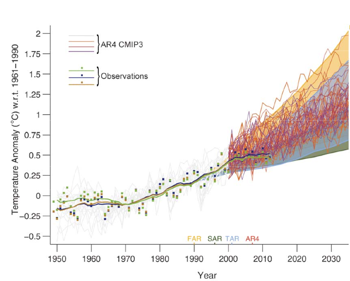
BhahahahahahahahaTwo idiots who can't even read a chart, no wonder they are STUPID enough to be deniers!!!Direct measurement only goes back to about the early 1800's...
He is so full of crap it isn't funny..
Clearly the graph lists HAD Instrumental Record (solid gray) and CRU Instrumental Record (solid red) as lines on the graph and as you can clearly see those lines begin around 1850. Many of the data lines do not run the full 1,000 years, but you two are not observant enough to see that, which is why you are so easily deceived by your fellow lying global warming deniers.

I notice warmists has a bad habit of not posting links for the charts they post.
Please post the link.