Asclepias
Diamond Member
Because they can kill people with their stupidity.Why care what others do?
Follow along with the video below to see how to install our site as a web app on your home screen.
Note: This feature may not be available in some browsers.
Because they can kill people with their stupidity.Why care what others do?
Unvaccinated people are only a risk to other Unvaccinated people. If you have the vaccine, why care?Because they can kill people with their stupidity.
You really cant figure out why I would care about someone dying that cant be vaccinated as opposed to someone that wont be vaccinated? Maybe I'm weird but I hate seeing toddlers die.If you have the vaccine, why care?
I live in the Florida panhandle and stopped by a hospital on Thursday to get some blood work done.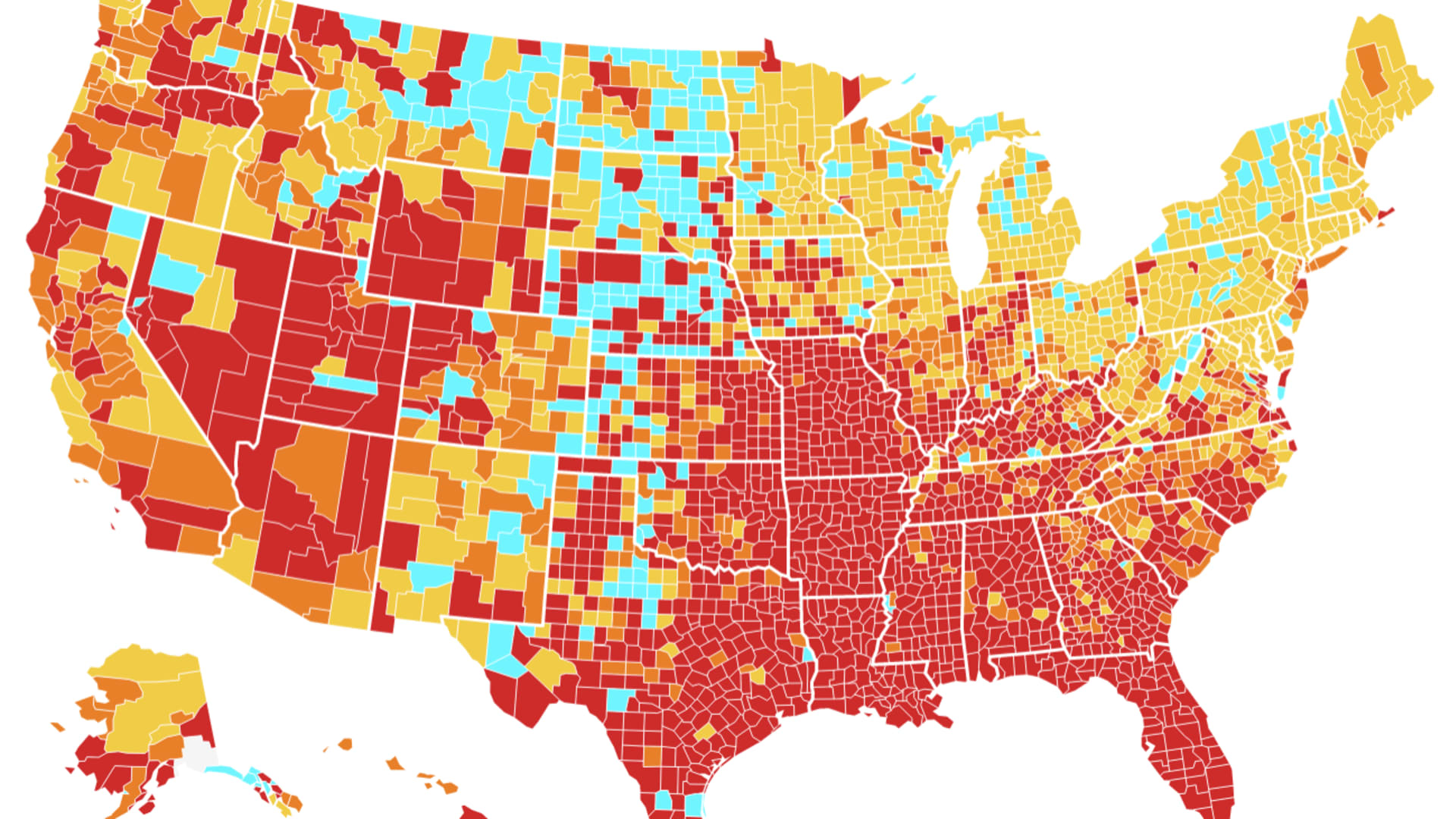
Should you be wearing a mask again? Here's a map of the Covid hot spots subject to the CDC's new guidance
The CDC recommended that fully vaccinated Americans in Covid hot spots start wearing masks again. This map shows where those hot spots are.www.cnbc.com
The entire state of Florida is hot red. Come on Little trump....use your brain!
What do people look like when they have the virus?and it didn’t look like they had the virus.
so unvaccinated person cant infect a vaccinated? or visa versa? where does this nonsense come from.Unvaccinated people are only a risk to other Unvaccinated people. If you have the vaccine, why care?

I've never seen one.What do people look like when they have the virus?
Sounds like the vaccine doesn't work...so unvaccinated person cant infect a vaccinated? or visa versa? where does this nonsense come from.
You wouldn't know if you had or not. They don't have a sticky attached to their head saying they have the virus.I've never seen one.
Drumpf said it works and works well. You're not going to differ from your orange god are you?Sounds like the vaccine doesn't work...
So nothing to fear.You wouldn't know if you had or not. They don't have a sticky attached to their head saying they have the virus.
Never did. I believe the Black lady that developed it. Now stop stalling and answer my question.You believe Drumpf now?
Should you be wearing a mask again? Here's a map of the Covid hot spots subject to the CDC's new guidance
The CDC recommended that fully vaccinated Americans in Covid hot spots start wearing masks again. This map shows where those hot spots are.
The entire state of Florida is hot red. Come on Little trump....use your brain!
Dont be stupid. Get the jab and stop trying to justify your selfishness.Even some leaders in the CDC dont trust CDC numbers. There's reason to believe they've screwed with the data AGAIN like they did 2 weeks ago when they DOUBLED the case number in Florida (by mistake) and later retracted.... DO THE DAMAGE and no one hears the apology... It's a famous POLITICAL tool...
No reason not to trust these independent numbers that have been updated every week thru July and August.. Totally DIFFERENT story looking at the RAW numbers..
Site says. "The information cited is from the Johns Hopkins Coronavirus Resource Center. States are arranged in descending order of test positivity rates." John Hopkins has CONTINUOUSLY MORE RELIABLE than the CDC... Ranked by HIGHEST transmission RATES -- Here's the TOP few. Get the rest at the link..
States ranked by COVID-19 test positivity rates
Here are the rates of positive COVID-19 tests in each state, along with the number of new cases most recently reported and number of tests conducted per 1,000 people.www.beckershospitalreview.com
Oklahoma: 52 percent
New daily cases: 2,468
Tests per 100,000: 100.2
Mississippi: 48.5
New daily cases: 4,412
Tests per 100,000: 198
Kansas: 38.5
New daily cases: 0
Tests per 100,000: 96.8
Idaho: 35.3
New daily cases: 751
Tests per 100,000: 73.2
Iowa: 30.7
New daily cases: 0
Tests per 100,000: 54.2
Georgia: 22
New daily cases: 7,016
Tests per 100,000: 249.5
Arkansas: 22
New daily cases: 2,318
Tests per 100,000: 345.2
Tennessee: 21.5
New daily cases: 5,507
Tests per 100,000: 261.1
**********************************************************************************
JUST REALIZED.. There's another game afoot here. The testing positivity rates are NOT the same as transmission rates that the CDC graphs in the Opost graph..
NOTE -- from the numbers above, NO state is higher than 52% test positive rate. But the TRANSMISSION rate is a MODELED number taking into account population density and other factors.
Now 52% positive test rates ARE SERIOUS.. But does not represent # of new cases. And transmission rates certainly dont tell you about # of new cases either... Test positive rates are affected by the TYPE of test, the state/local testing mandates, and the number of times a person who is under medical supervision is tested while sick (and other things)..
Dont be stupid. Get the jab and stop trying to justify your selfishness.
No thats not stupid. Whats stupid is seeing all these people die or wind up in ICU and over analyzing the situation because you dont want to get the jab.So caring about truth in numbers or how folks lie/mislead with graphs is stupid?
You just want me to disclose my vax status publicly. Prettty clever,. But you first. I just sent you mine in PM.. Unlike MOST here -- I take all of this DEADLY serious. And what is the largest problem is no one is explaining the science/data like they're talking to adults.. And orgs and govt agencies/media are taking advantage of that to move MESSAGES -- not the knowledge.No thats not stupid. Whats stupid is seeing all these people die or wind up in ICU and over analyzing the situation because you dont want to get the jab.